Klient:
HAZELNUT FARM Butter
Love Nutty - halva packaging
K PORTFÓLIU
Love Nutty - halva packaging
Služba:
Dizajn značiek
,
Dizajn obalov
,
Retušovanie
,
Fotografia
,
Priemyselný dizajn
,
Vizualizácia obalov
Priemyselné odvetvie:
Eko-výrobky
,
Cukrovinky
K PORTFÓLIU
By preserving the recognizability of the category, but translating it into the language of modern healthy eating?
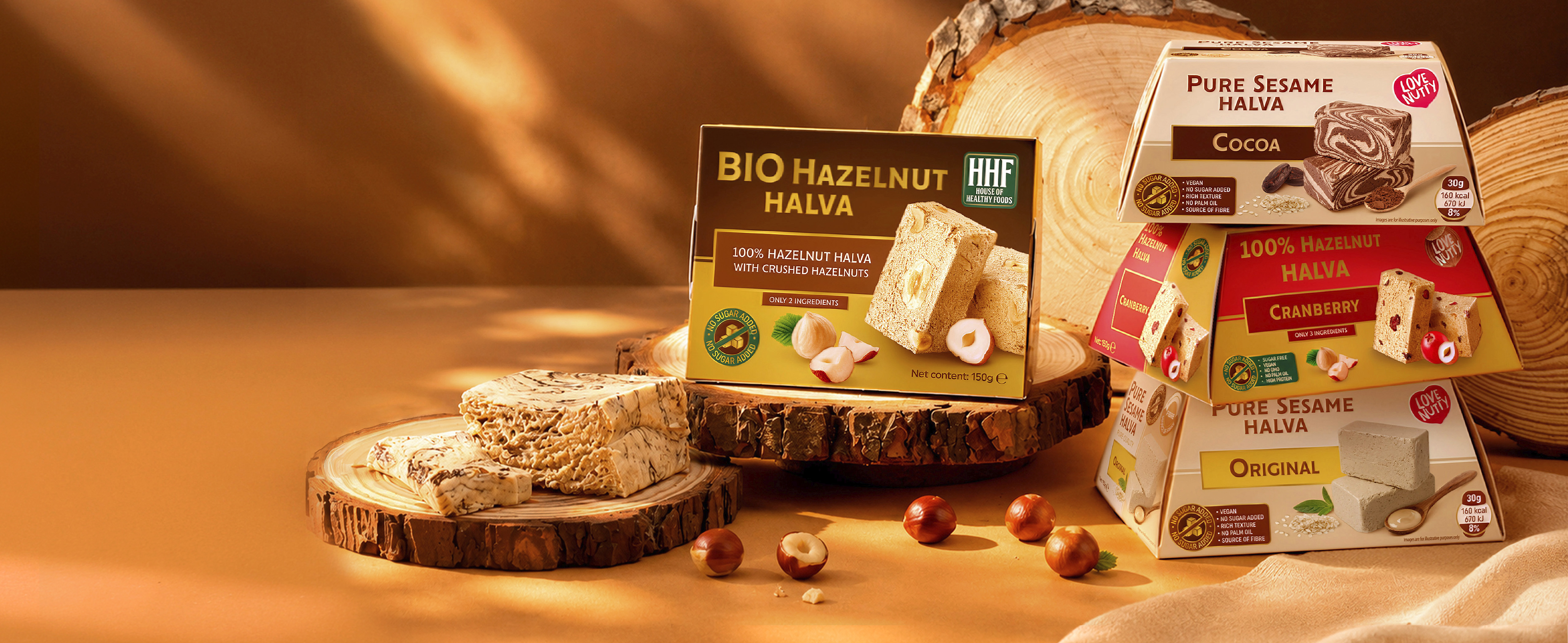
This was one of the main questions with which we began work on Love Nutty — a new brand and startup project, created with the ambition to offer a different look at one of the most traditional products — halva. Behind Love Nutty is serious work on the product itself. The client has invested significant know-how, time and investment in developing the recipes and selecting high-quality ingredients, including raw materials from their own farm. The goal is clear — to create a halva that retains the pleasure and rich taste of the traditional product, but meets modern expectations for a more balanced and conscious diet. Our task was to make this change visible even before opening the box.
This was one of the main questions with which we began work on Love Nutty — a new brand and startup project, created with the ambition to offer a different look at one of the most traditional products — halva. Behind Love Nutty is serious work on the product itself. The client has invested significant know-how, time and investment in developing the recipes and selecting high-quality ingredients, including raw materials from their own farm. The goal is clear — to create a halva that retains the pleasure and rich taste of the traditional product, but meets modern expectations for a more balanced and conscious diet. Our task was to make this change visible even before opening the box.
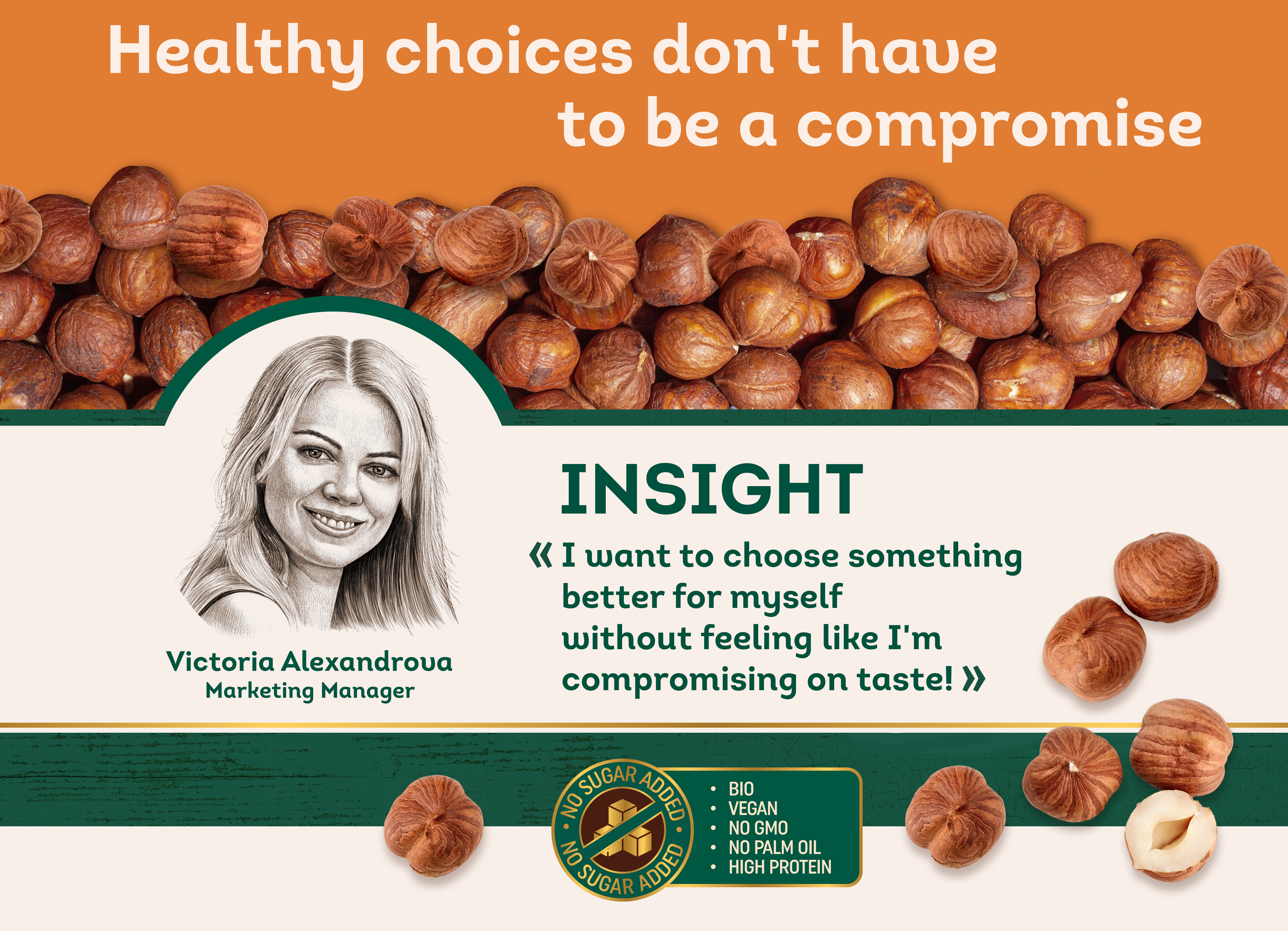
This has become the main consumer insight of the project. The consumer is choosing their food more and more carefully. They read the ingredients, are interested in the origin of the raw materials, look for products without added sugar, with more fiber, plant-based ingredients and a better nutritional profile. But when choosing a dessert, they continue to look for something very simple - pleasure. And this is exactly where the packaging design had to find the right balance. How can we show the healthy nature of the product without the packaging looking dietetic? How can we communicate the healthy lifestyle category without falling into the familiar clichés of "healthy" design? How can we maintain the appetizing taste and the feeling of pleasure? And how can we tell the consumer right from the shelf: This is halva. But not exactly the kind you know.
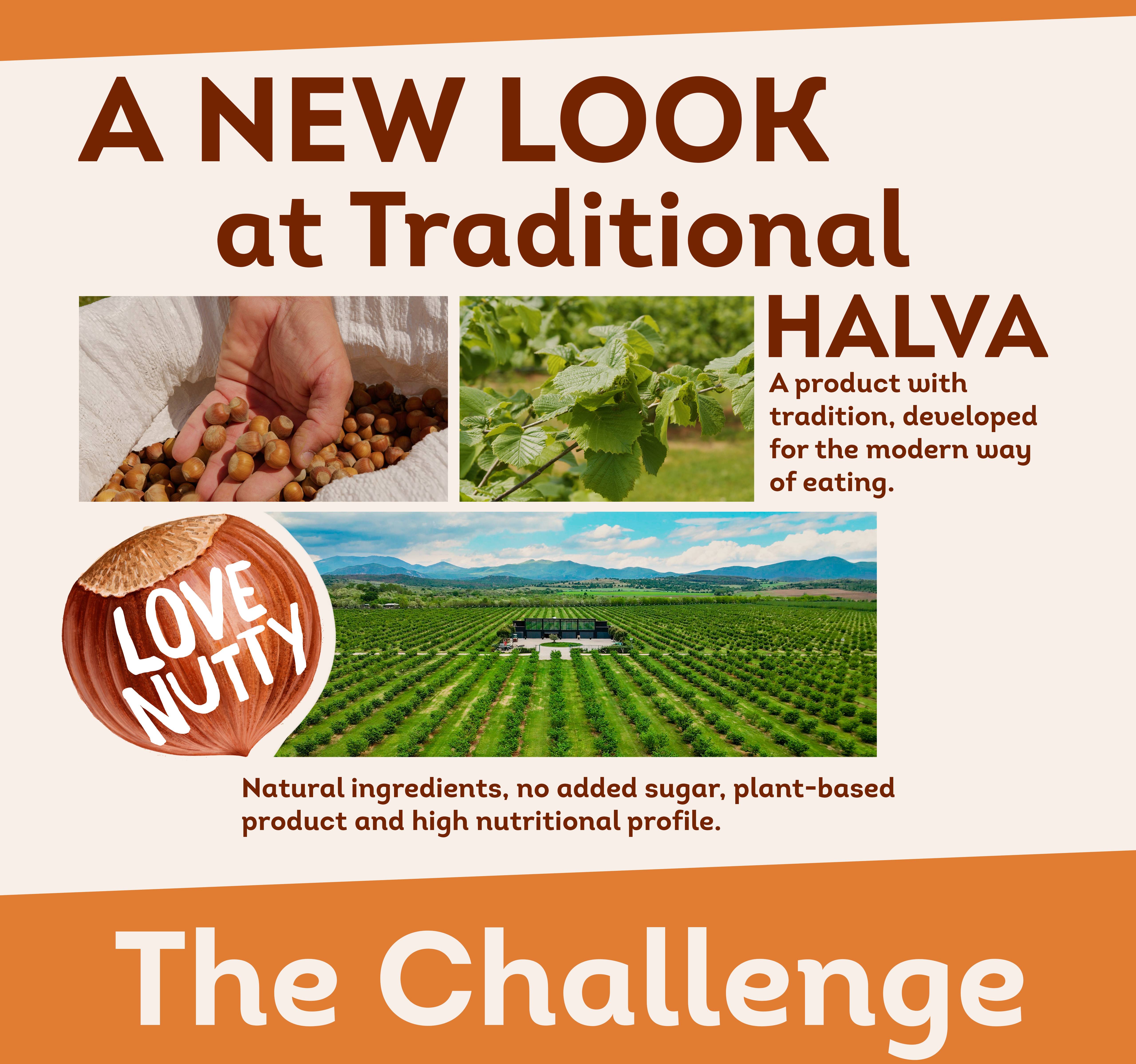
What does a traditional category look like when the product is no longer traditional? Halva has a strongly established visual code. It is a product with a history, a familiar taste and certain expectations for the way it looks. However, Love Nutty did not want to be just another halva on the shelf. New recipes, unusual flavor combinations and a different nutritional profile placed the product in a much more contemporary context. Therefore, the packaging could not rely on traditional visual solutions for the category. We had to build a new visual language that would both carry the recognition of halva and move it into the world of modern products for a healthy lifestyle. This posed a whole series of questions for us.
Send feedback
- What should be the color of healthy halva?
- How “healthy” should a package look before it starts to lose its appetizingness?
- How to show the quality of the ingredients?
- How to communicate the different product benefits without overloading the face with claims?
- How do we build a system that works equally well for a classic flavor, protein halva, matcha, or roses?
Send feedback
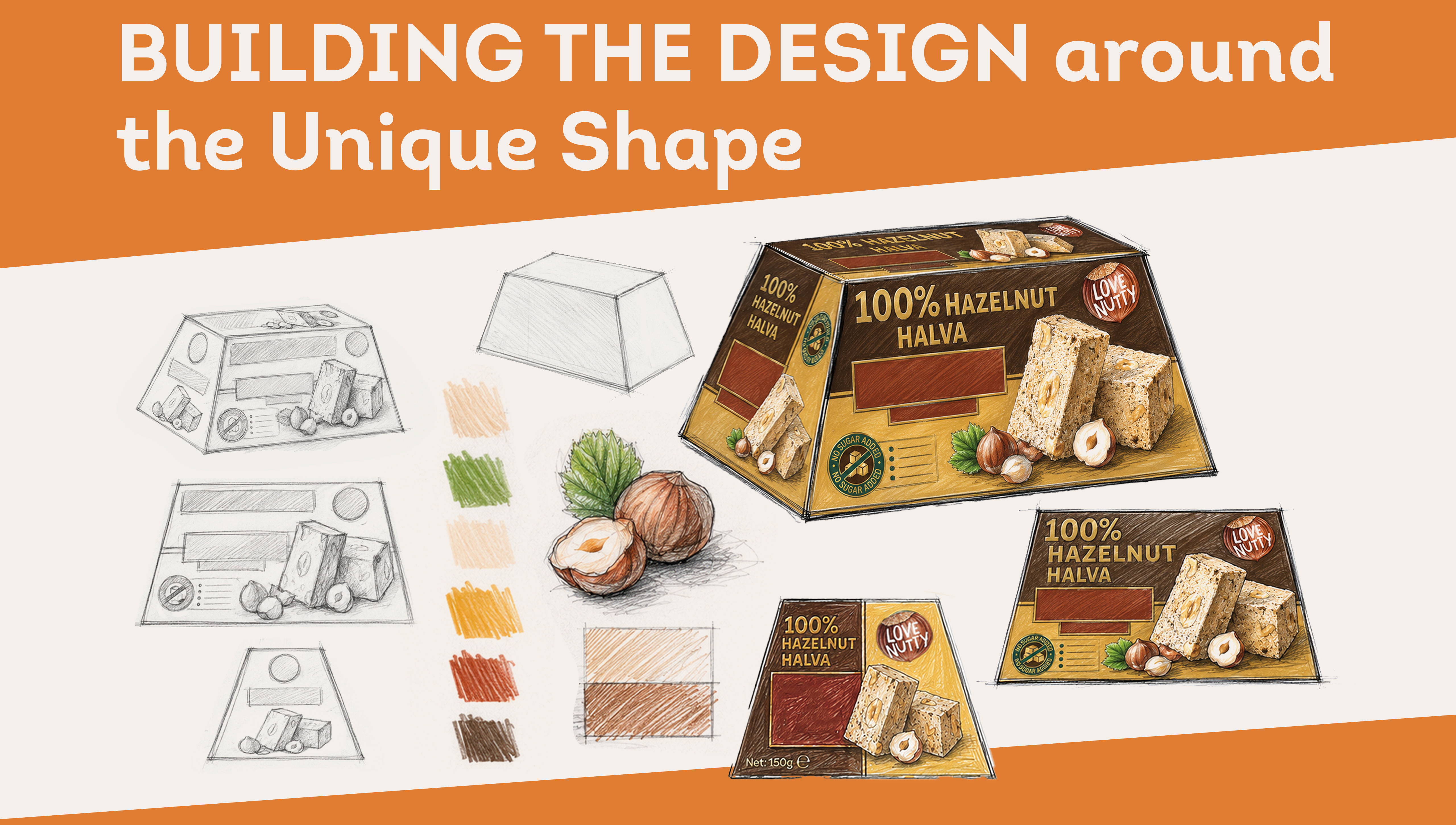
360° PACKAGING DESIGN
Which is the front?
One of the most interesting technical challenges of the project came from the design of the box itself. In the real retail environment, there is no guarantee that the product will always be placed on the shelf in a predetermined position. The box can be turned over. It can be placed vertically or with the other communication side facing forward. It can be arranged differently depending on the size and configuration of the shelf. And this changed the way we thought about design. We could not create one beautiful face and let the other sides be just technical panels.
What happens if the retailer turns the box over?
Will the product remain recognizable? Will the taste be visible? Will we immediately know what is inside? Will the packaging continue to sell?
That's why we approached the design as a 360° communication surface. The main sides of the box received their own composition, but retained the key elements of identity - product, flavor, color code and visual character. So regardless of which of the main communication sides is facing the consumer, the essence of the product remains visible. 360° PACKAGING DESIGN
One of the most interesting technical challenges of the project came from the design of the box itself. In the real retail environment, there is no guarantee that the product will always be placed on the shelf in a predetermined position. The box can be turned over. It can be placed vertically or with the other communication side facing forward. It can be arranged differently depending on the size and configuration of the shelf. And this changed the way we thought about design. We could not create one beautiful face and let the other sides be just technical panels.
What happens if the retailer turns the box over?
Will the product remain recognizable? Will the taste be visible? Will we immediately know what is inside? Will the packaging continue to sell?
That's why we approached the design as a 360° communication surface. The main sides of the box received their own composition, but retained the key elements of identity - product, flavor, color code and visual character. So regardless of which of the main communication sides is facing the consumer, the essence of the product remains visible. 360° PACKAGING DESIGN
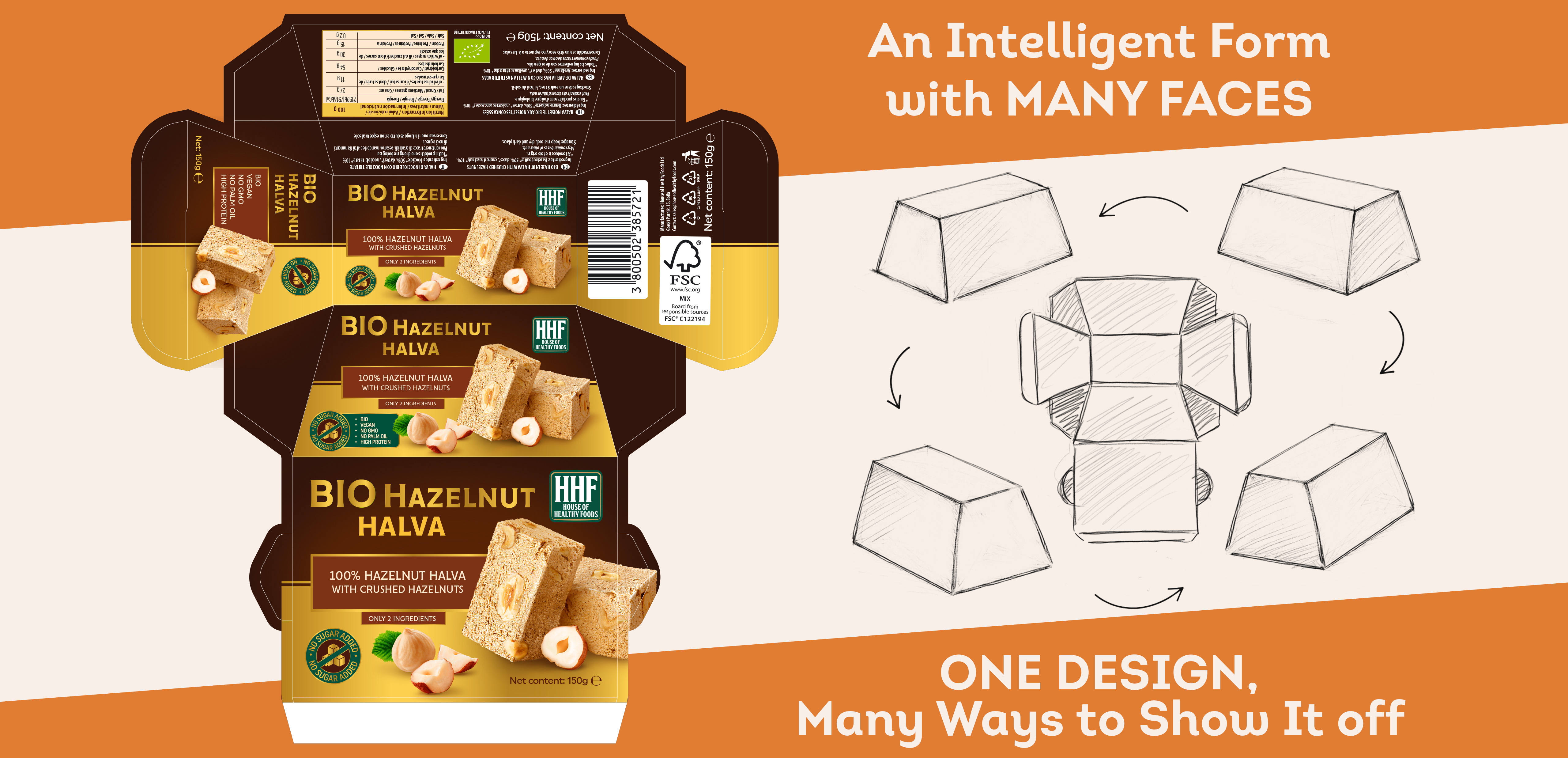
DESIGN DOESN'T END WITH BEAUTIFUL VISUALIZATION
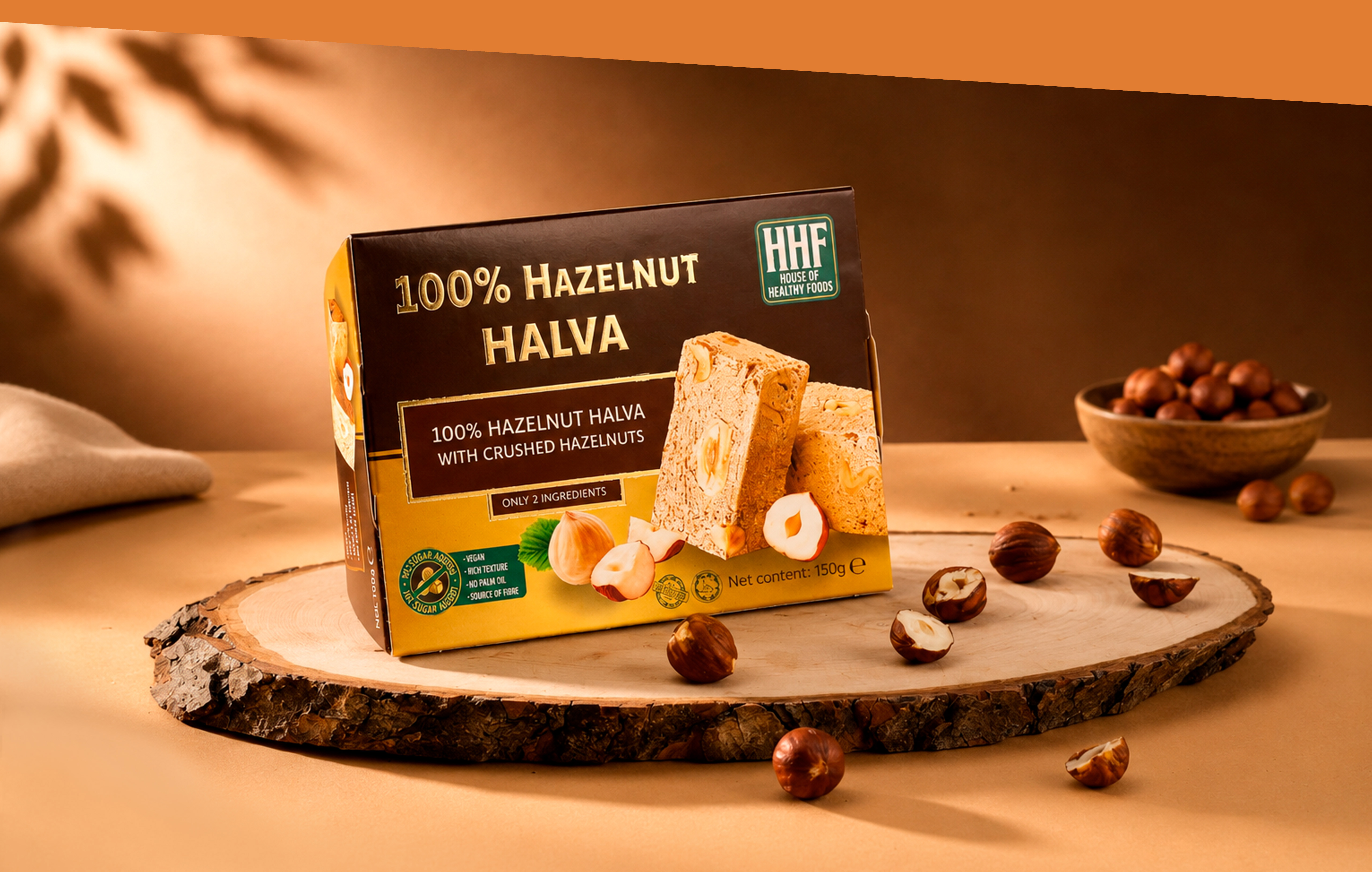
In the case of packaging, the idea must survive even after meeting with the printing house. Therefore, the project continued with the detailed development of all sides of the structure, information panels, barcodes, nutritional tables, mandatory markings and technical elements. Special printing effects were also planned in the design. For certain elements, Gold Hot Print is provided, which adds a premium accent to the natural and warm color system of the series. Thus, the decorative effect is not an end in itself, but another tool for positioning the product. Because good packaging design does not end with the approved vision. It ends when the actual box on the shelf looks as it was intended.
PRODUCT ARCHITECTURE
Three series. One brand. One visual language.
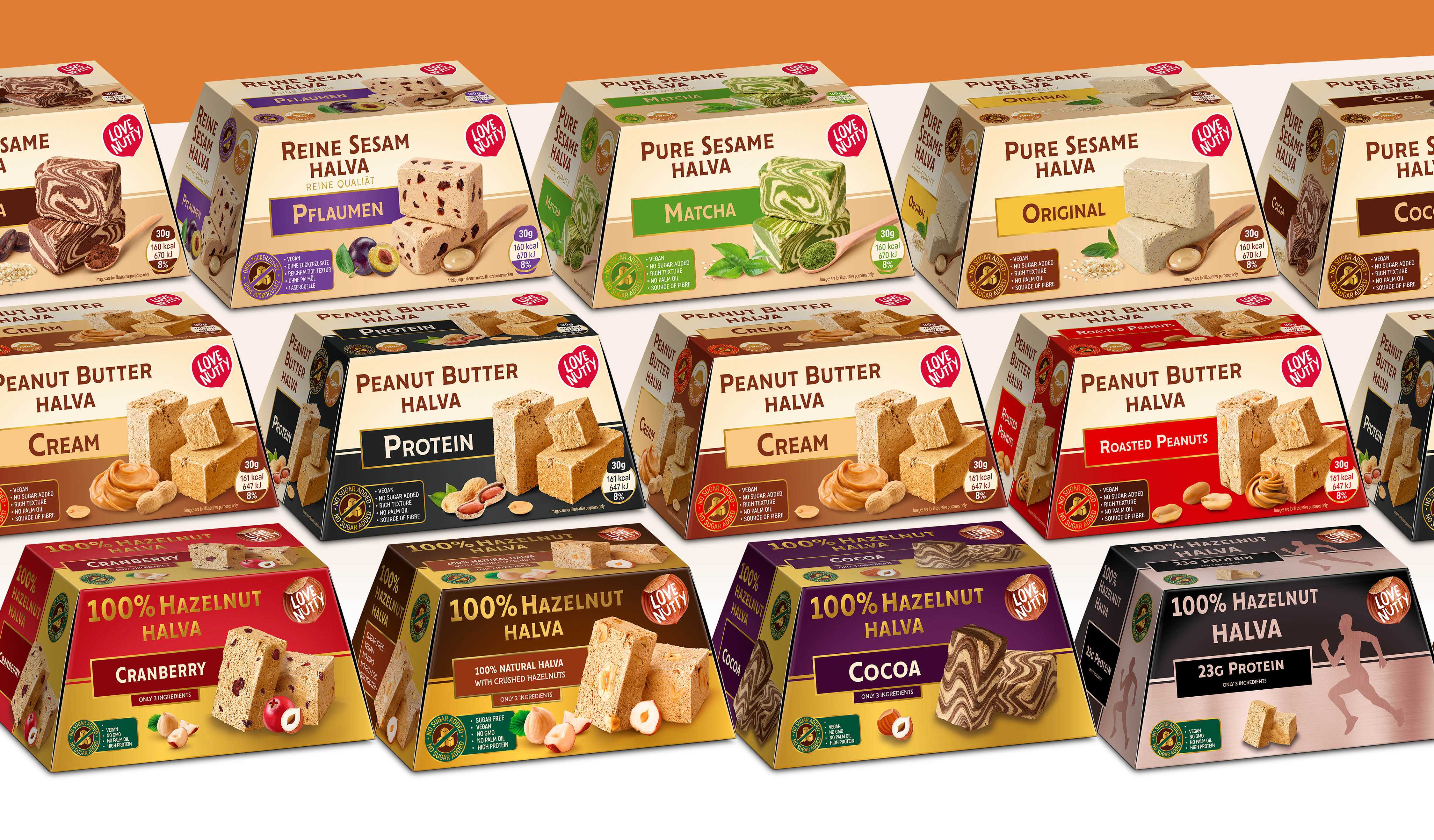
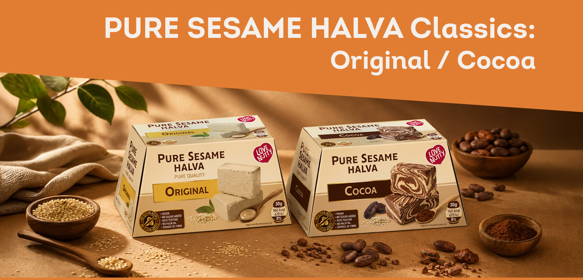
It was clear from the beginning that we were not designing individual packages, but a system that should organize the entire portfolio and allow it to grow in the future. We divided the products visually into three main directions.
It was clear from the beginning that we were not designing individual packages, but a system that should organize the entire portfolio and allow it to grow in the future. We divided the products visually into three main directions.
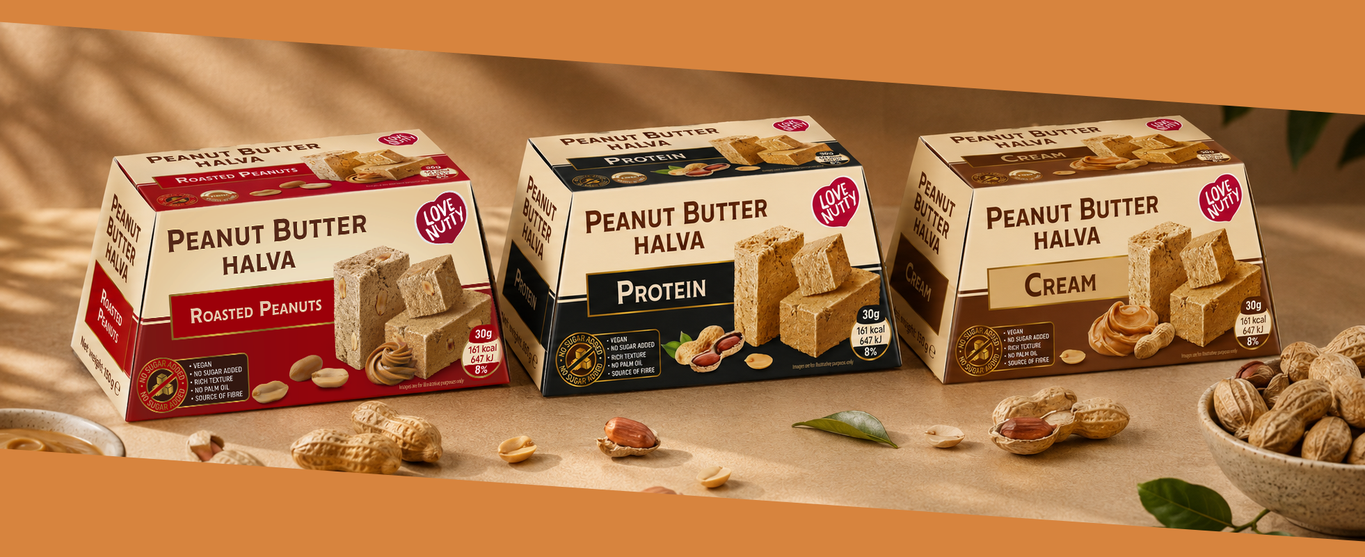
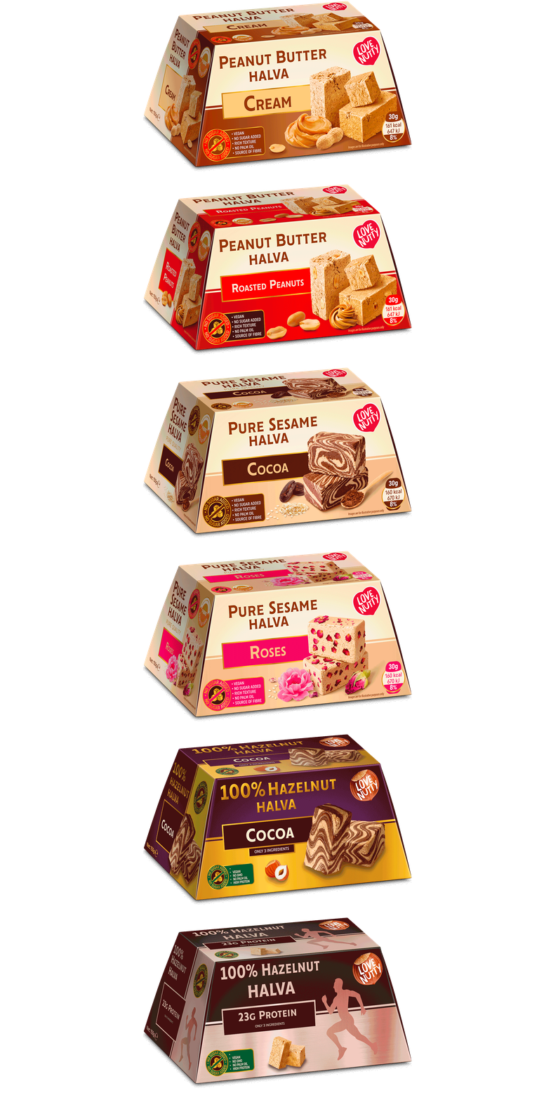
Peanut Butter Halva: The bolder and more contemporary line in the portfolio: Roasted Peanuts / Cream / Protein.
Here we used more categorical contrasts and stronger color fields — red for Roasted Peanuts, warm caramel and brown shades for Cream and an almost black base for Protein. This is the series with the strongest contemporary character and therefore its visual language had to be more energetic and direct.
Here we used more categorical contrasts and stronger color fields — red for Roasted Peanuts, warm caramel and brown shades for Cream and an almost black base for Protein. This is the series with the strongest contemporary character and therefore its visual language had to be more energetic and direct.
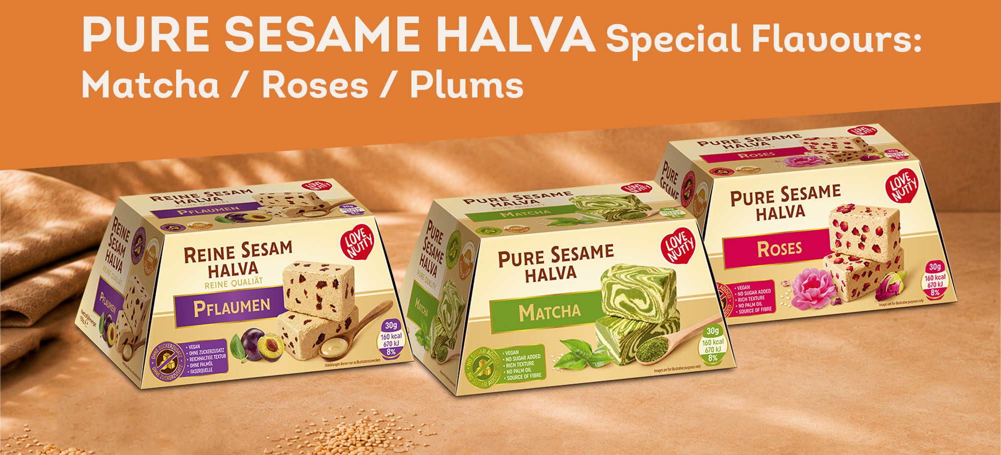
Pure Sesame Halva: Special Flavours - Matcha / Roses / Plums
This is the most expressive part of the series. The unusual flavours allowed us to use colour much more boldly - fresh green for Matcha, bright pink for Roses and violet for Plums.
The three lines have different characters, but share the same compositional logic and remain clearly recognisable as part of Love Nutty.
This is the most expressive part of the series. The unusual flavours allowed us to use colour much more boldly - fresh green for Matcha, bright pink for Roses and violet for Plums.
The three lines have different characters, but share the same compositional logic and remain clearly recognisable as part of Love Nutty.
THE RESULT
Eight products, three series and one recognizable system.
At Love Nutty we had to solve a seemingly contradictory task. To preserve the feeling of halva, but to escape the traditional visual code of the category. To talk about healthy eating, but to remain appetizing. To give each flavor its own character, without losing the brand's recognizability. To show a product that is not physically visible. And to create a design that works not only on the front, but on the entire structure of the package. The result is a complete packaging system, in which product architecture, color, typography, photography, retouching, claims and structure work together. Not just eight beautiful boxes. But a visual language that allows a startup to enter the market with a complete, recognizable and ready-to-develop product family.
Love Nutty — a new visual language for a traditional category.
At Love Nutty we had to solve a seemingly contradictory task. To preserve the feeling of halva, but to escape the traditional visual code of the category. To talk about healthy eating, but to remain appetizing. To give each flavor its own character, without losing the brand's recognizability. To show a product that is not physically visible. And to create a design that works not only on the front, but on the entire structure of the package. The result is a complete packaging system, in which product architecture, color, typography, photography, retouching, claims and structure work together. Not just eight beautiful boxes. But a visual language that allows a startup to enter the market with a complete, recognizable and ready-to-develop product family.
Love Nutty — a new visual language for a traditional category.