Pepenada Watermelon Drink
TO PORTFOLIO
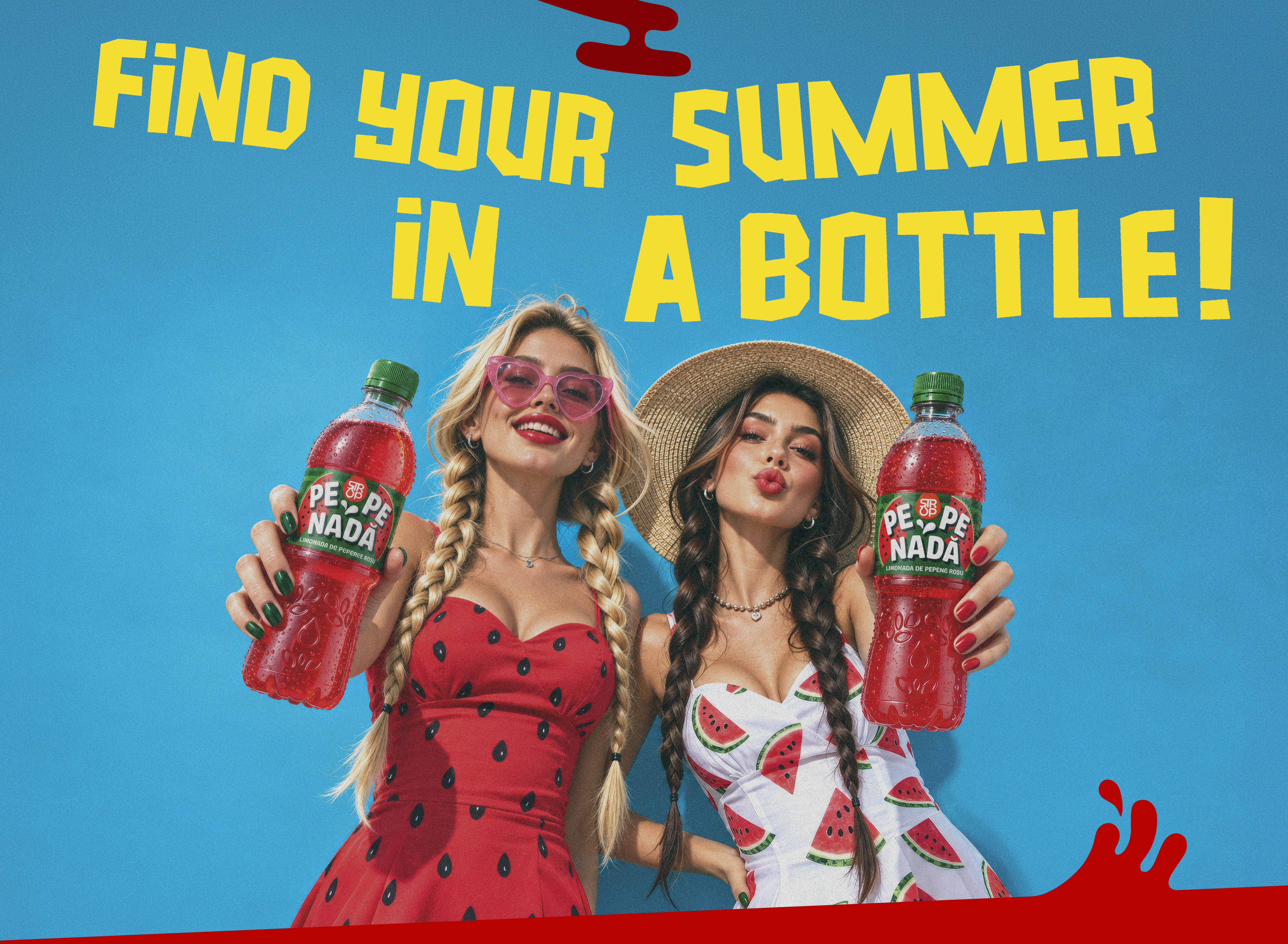
When your products are on the shelves of major retail chains, gas stations, and stores across diverse European markets, packaging design becomes a key competitive tool. This was precisely the challenge brought to us by Europlant International S.R.L. — an established Romanian manufacturer of natural fruit and organic syrups with a broad market presence. In an environment where dozens of brands compete for consumer attention and purchasing decisions are made in seconds, the new design had to do more than just look good.
It needed to set the products apart, highlight their unique character, and make them instantly recognizable at first glance.
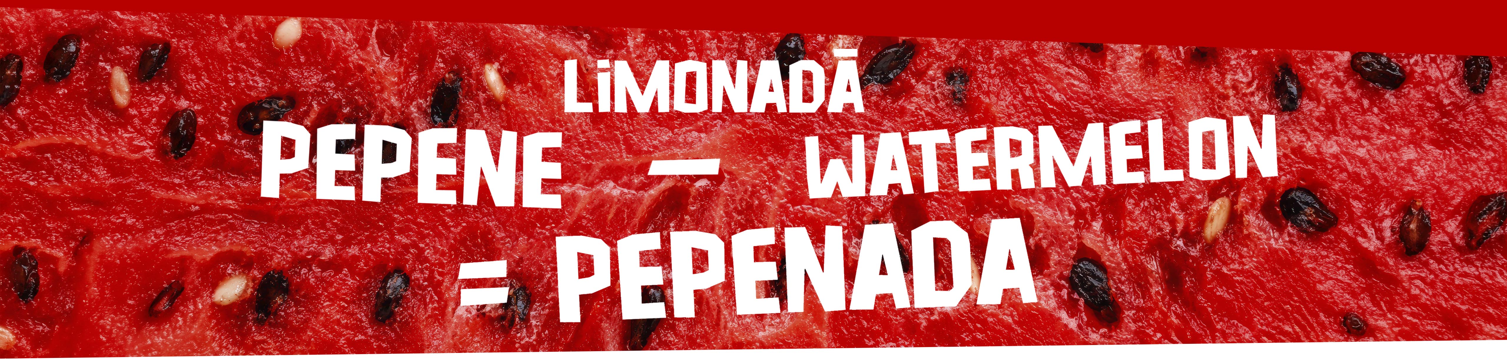
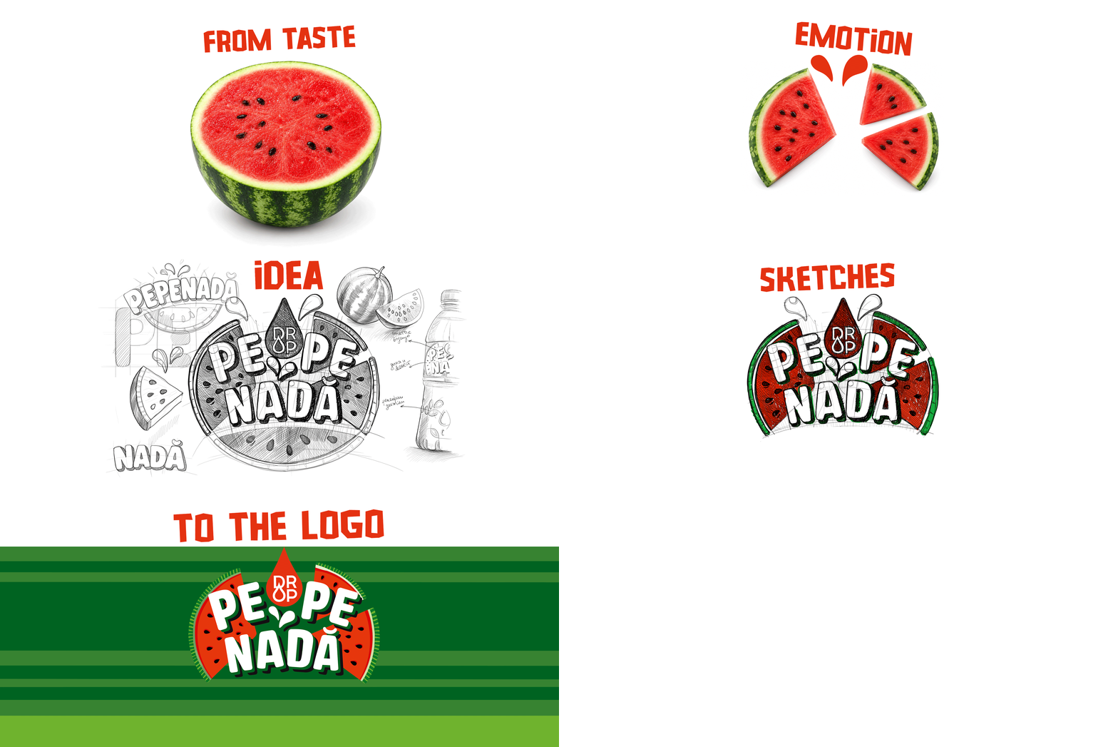
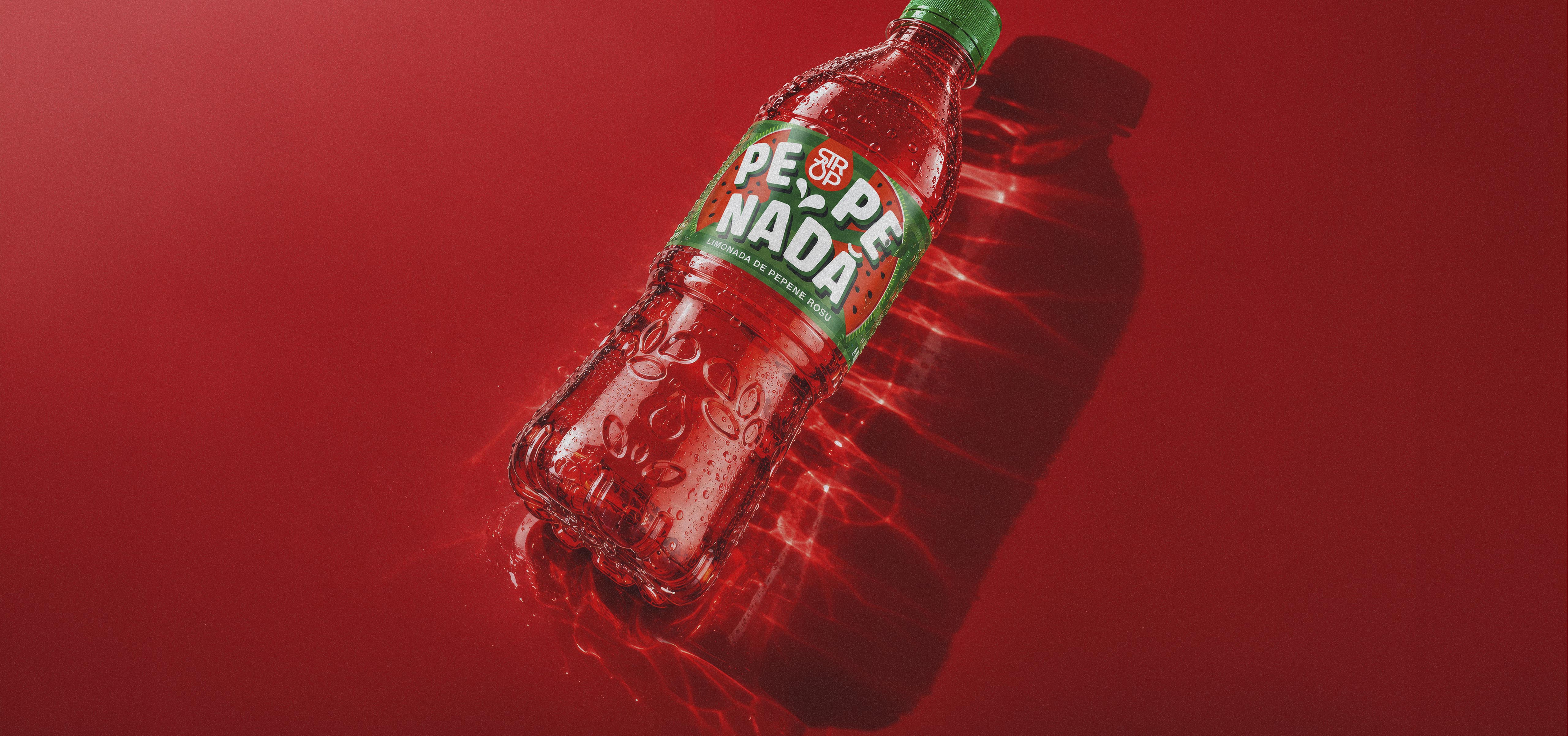
A product is not created to blend into the shelf. That is why we wanted to build a bold, emotional, and distinctive design that captures the consumer’s attention before they even read the name. Pepenada has its own taste, energy, and personality. Our task was to transform these traits into a memorable visual identity. With this vision, the initial design phase began ...
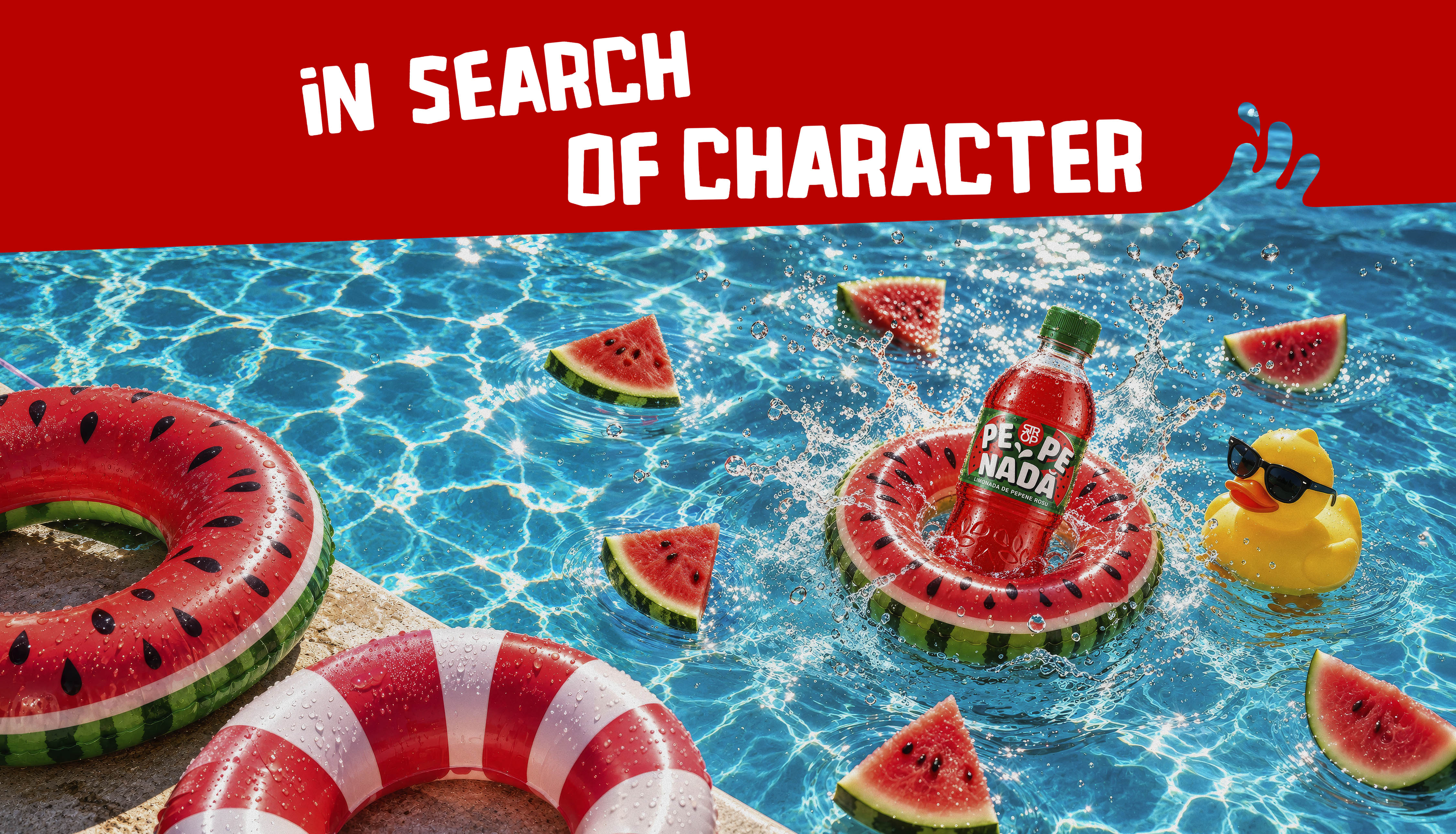

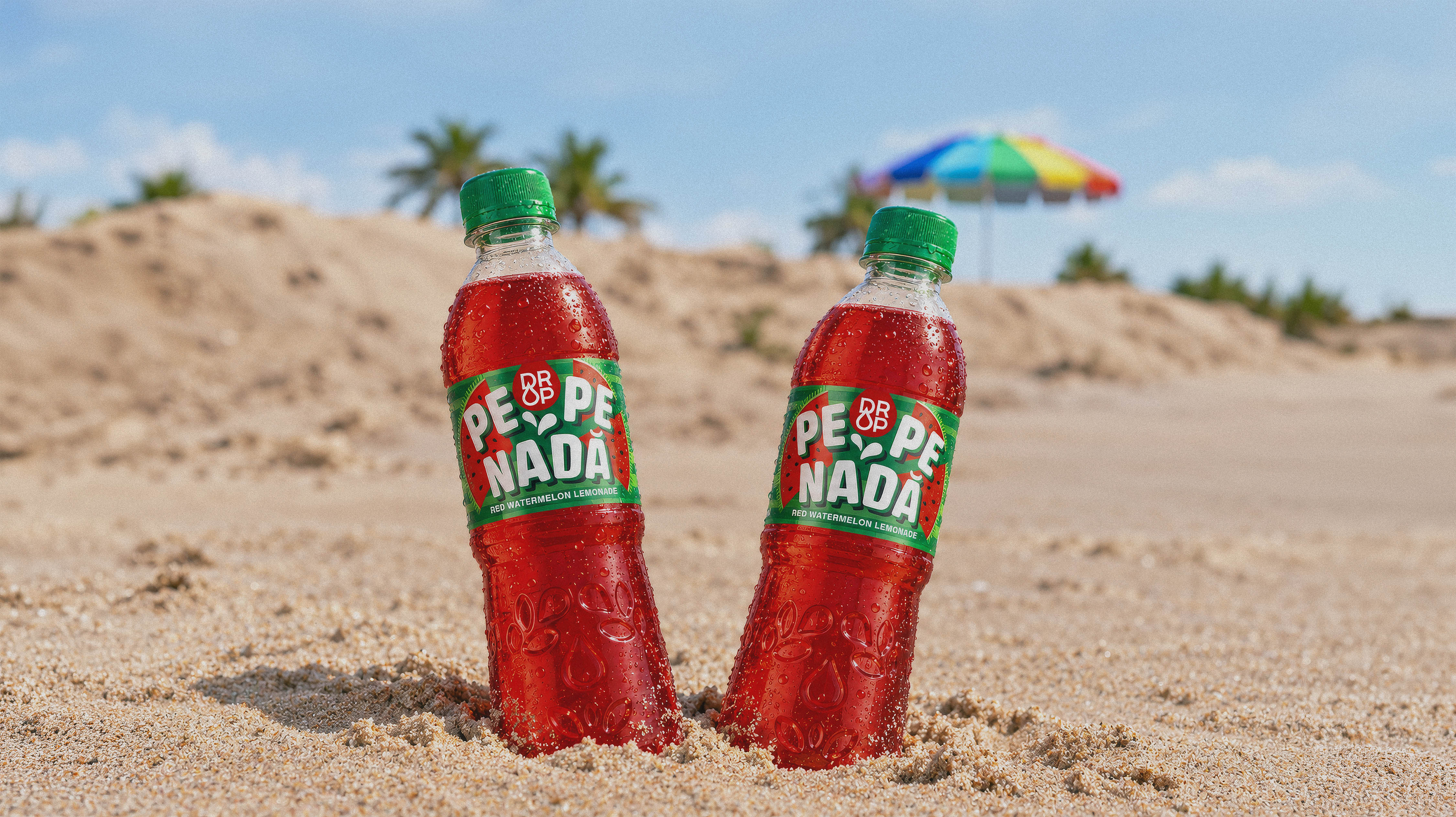
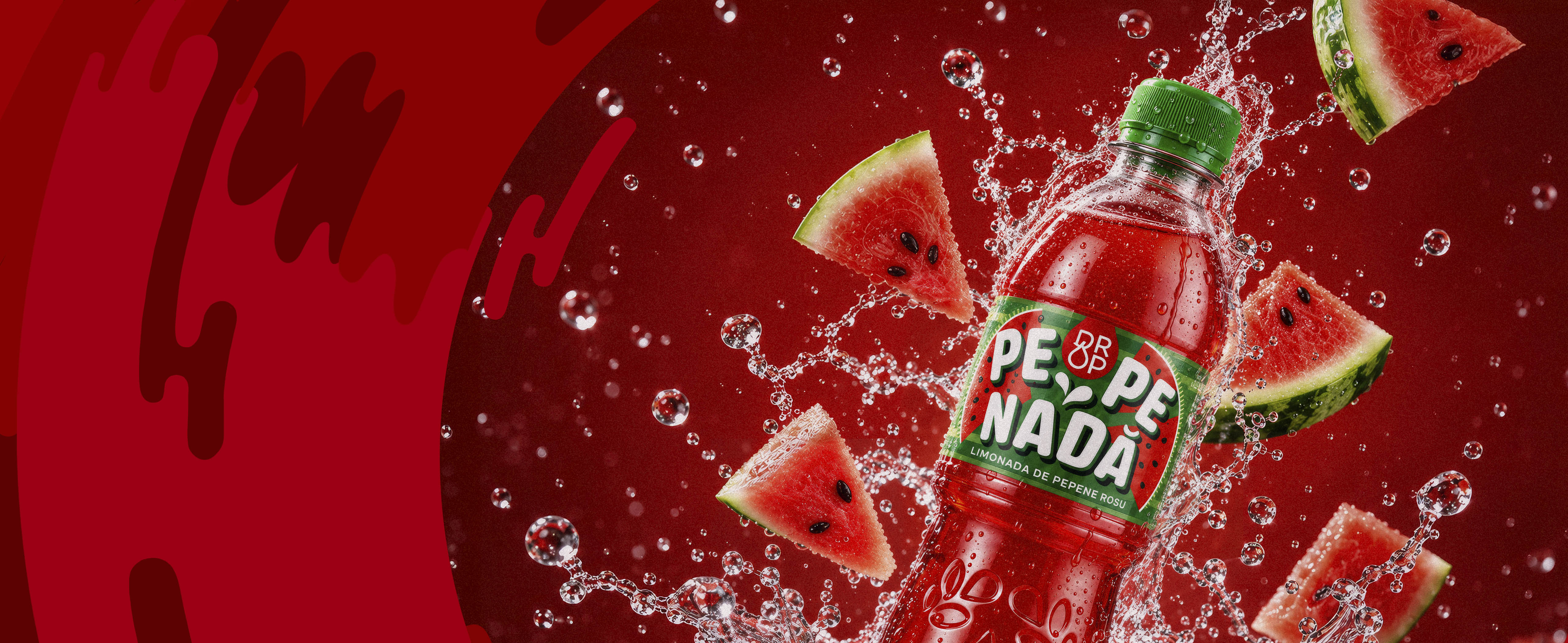
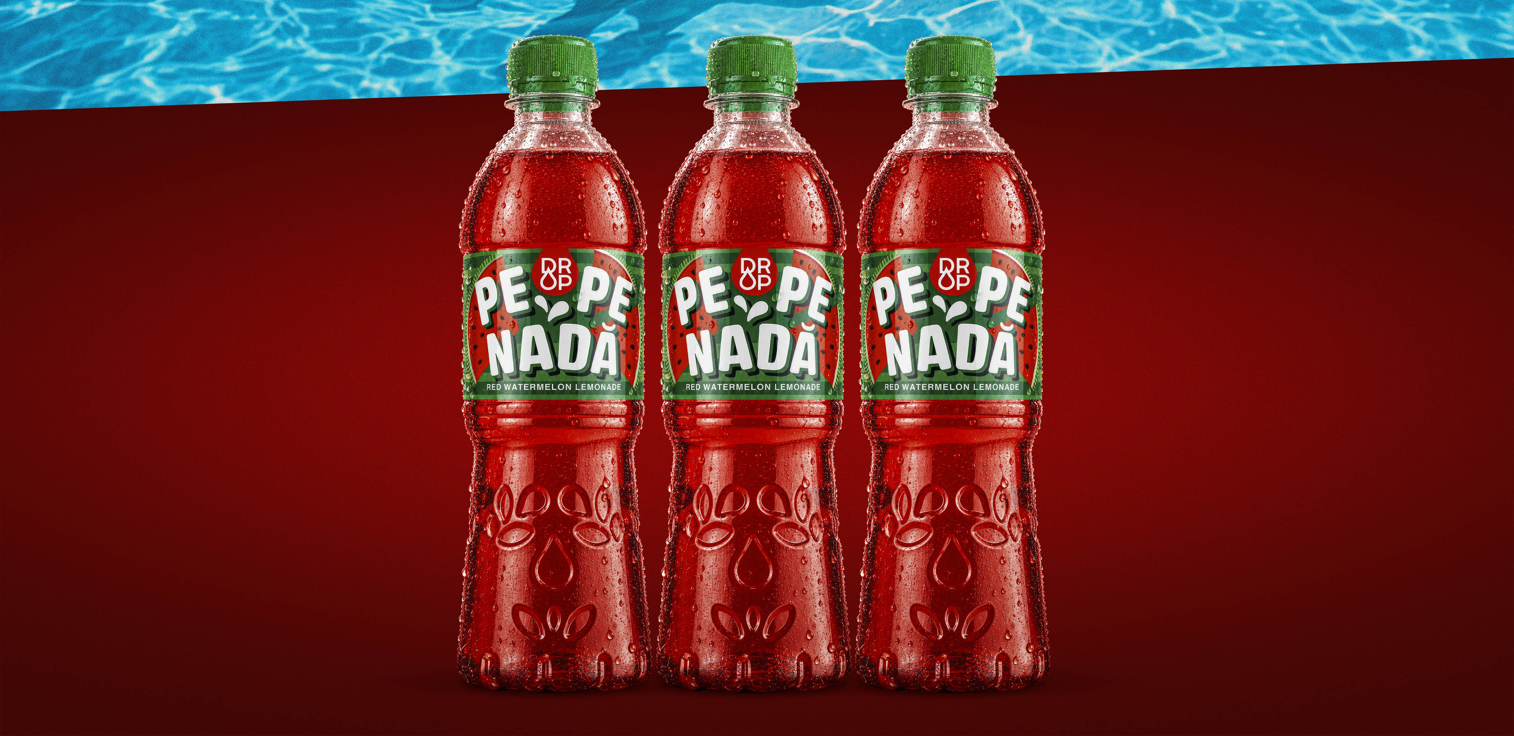
With Pepenada, flavour takes centre stage — so we made the distinctive colour of watermelon the foundation of the visual concept. Intense watermelon red meets fresh green and bright white, creating a distinctive colour system for the lemonade label design. The contrast between the graphic elements, the colour of the drink and the green cap brings the entire packaging design together into a cohesive, recognisable look. The result communicates the watermelon flavour at first glance, before the consumer even reads the Pepenada name.
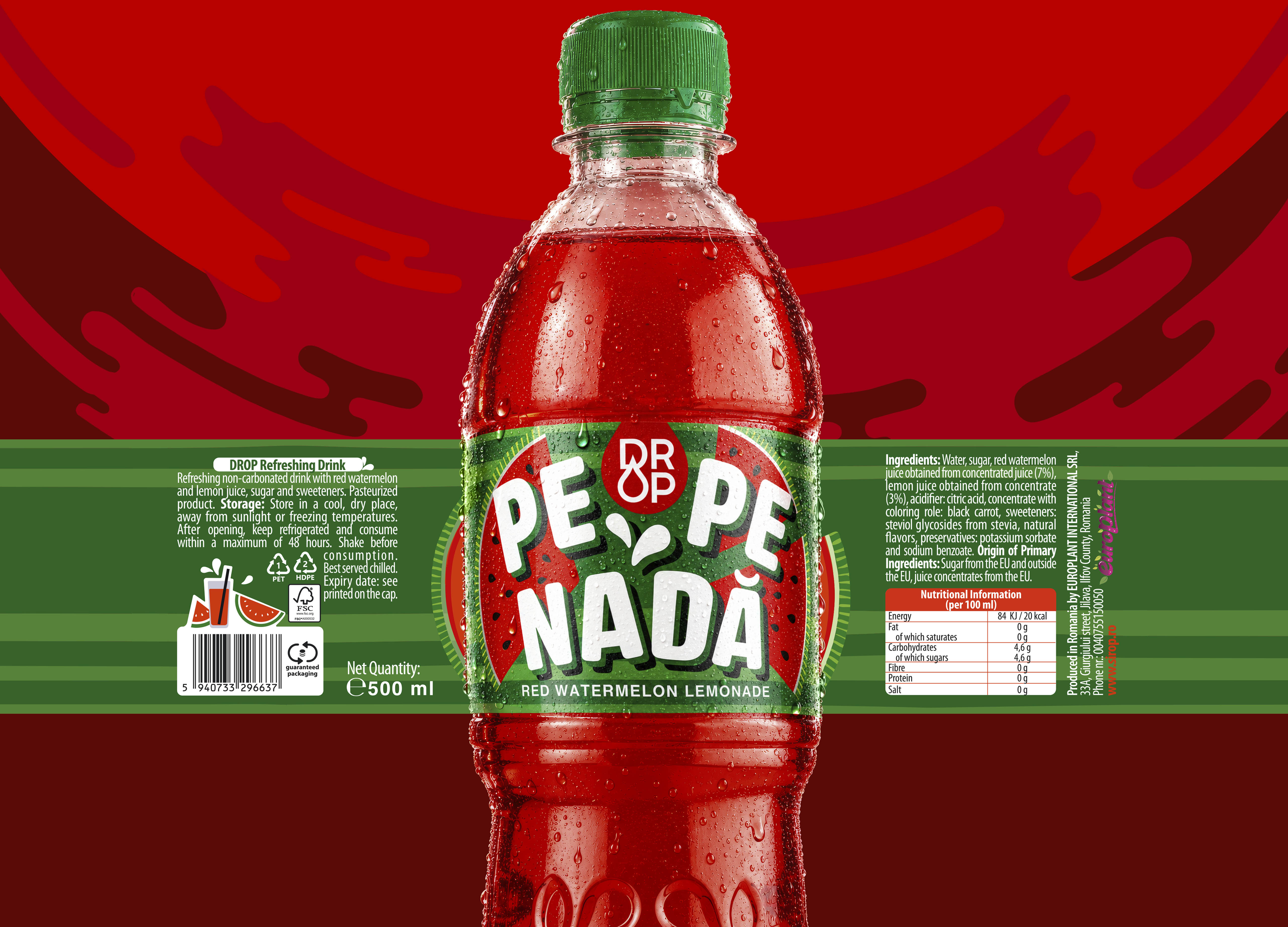

The visual concept for Pepenada is built around bold contrast and vibrant, juicy colours that capture the freshness of watermelon. The lemonade label design features stylised watermelon slices and contrasting black seeds, arranged as a repeating graphic motif that adds texture and visual rhythm.
Deep green and bright watermelon red are complemented by the natural colour of the drink inside the transparent bottle, creating an immediate visual connection to the fruit itself. White accents, droplets and leaves enhance the sense of juiciness and refreshing coolness. Every element of the packaging design works together to make the watermelon flavour instantly recognisable at first glance.
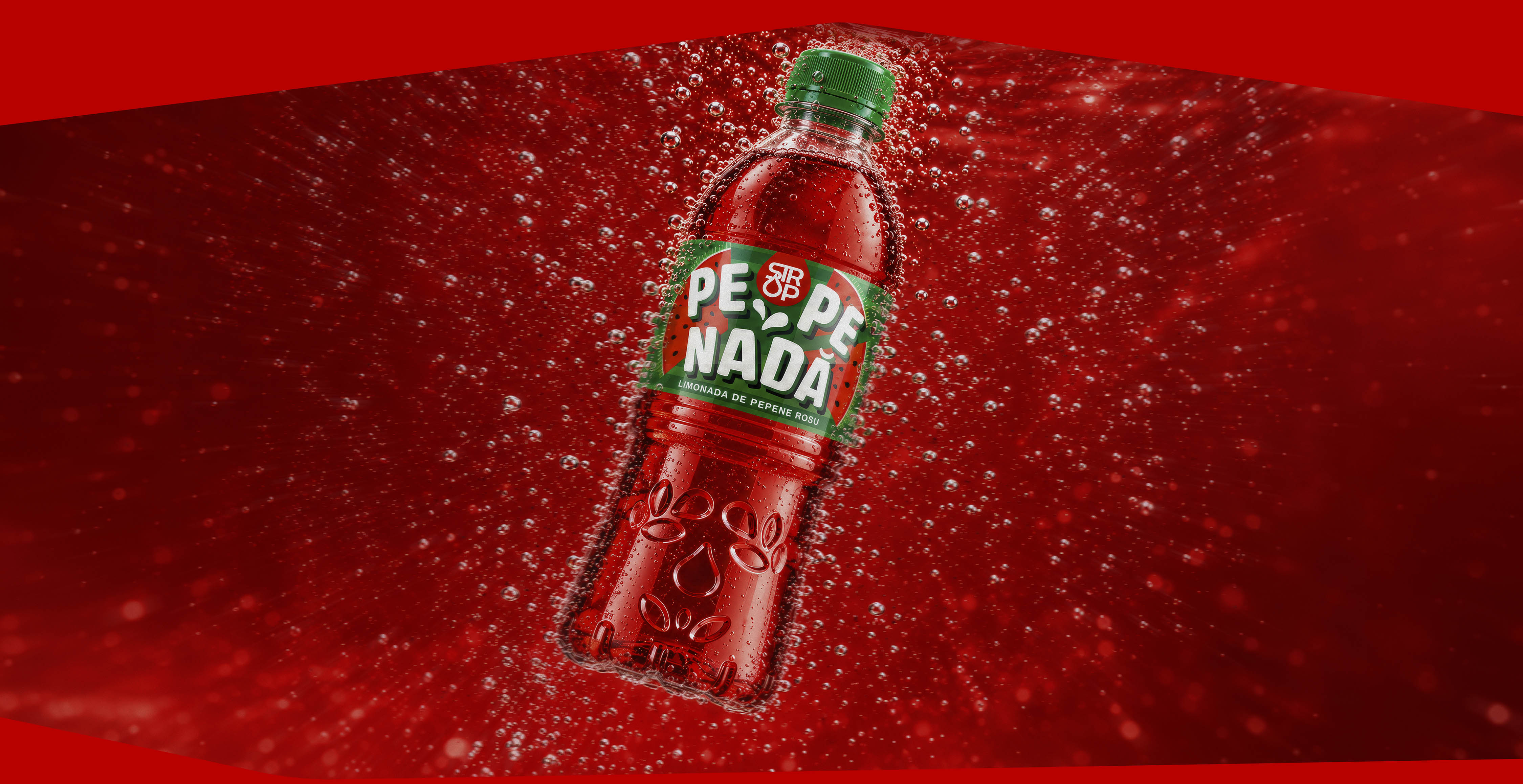
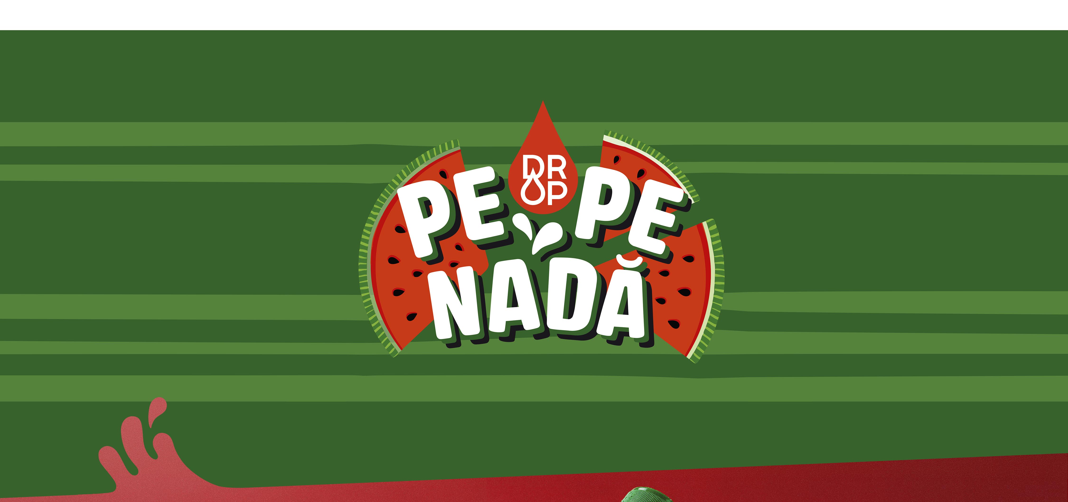
In the Pepenada lemonade label design, typography takes centre stage as the main graphic element. The name PEPENADA is set in large white letters that break away from conventional layouts, create movement and turn the wordmark into the focal point of the packaging. This bold typographic approach builds strong shelf recognition and helps the product stand out from a distance.
The visual concept reinterprets watermelon through its most distinctive features — intense red, fresh green, black seeds and organic shapes. Rather than relying on a literal image of the fruit, these graphic details are arranged around the typography to create rhythm, energy and a sense of controlled spontaneity. The result is a cohesive packaging design and visual identity that combines expressive typography with stylised fruit motifs, communicating the flavour and freshness of watermelon lemonade at first glance.
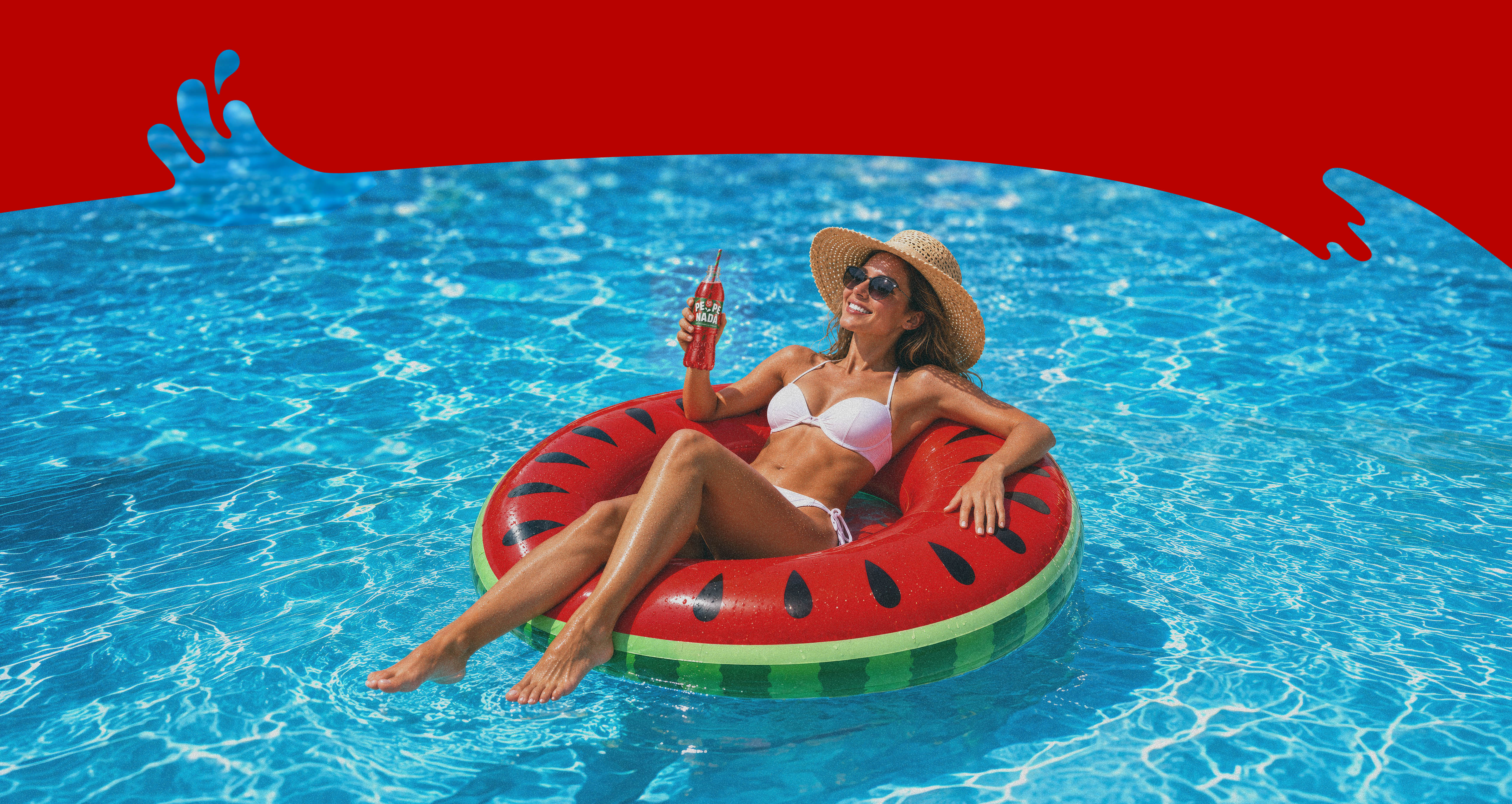
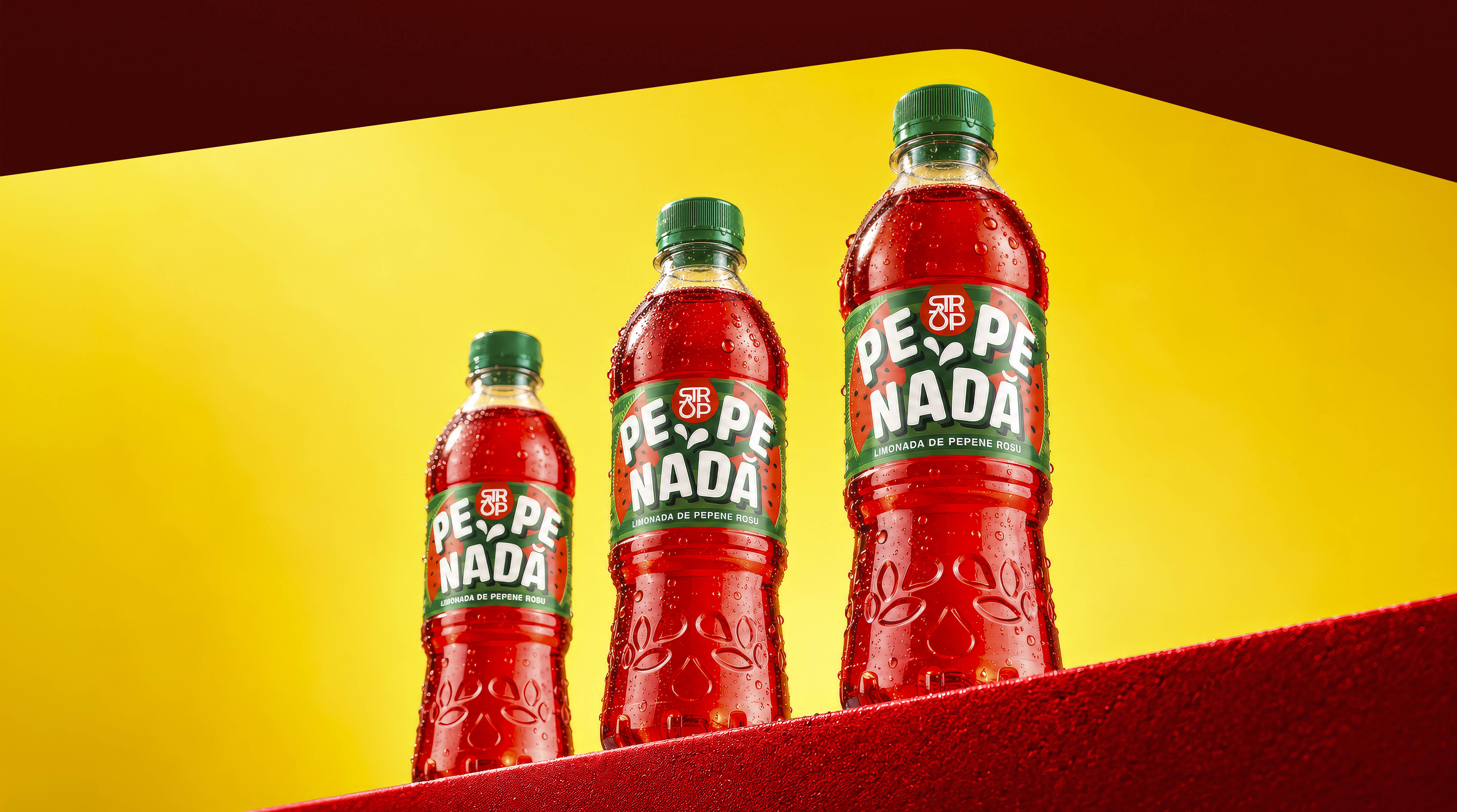

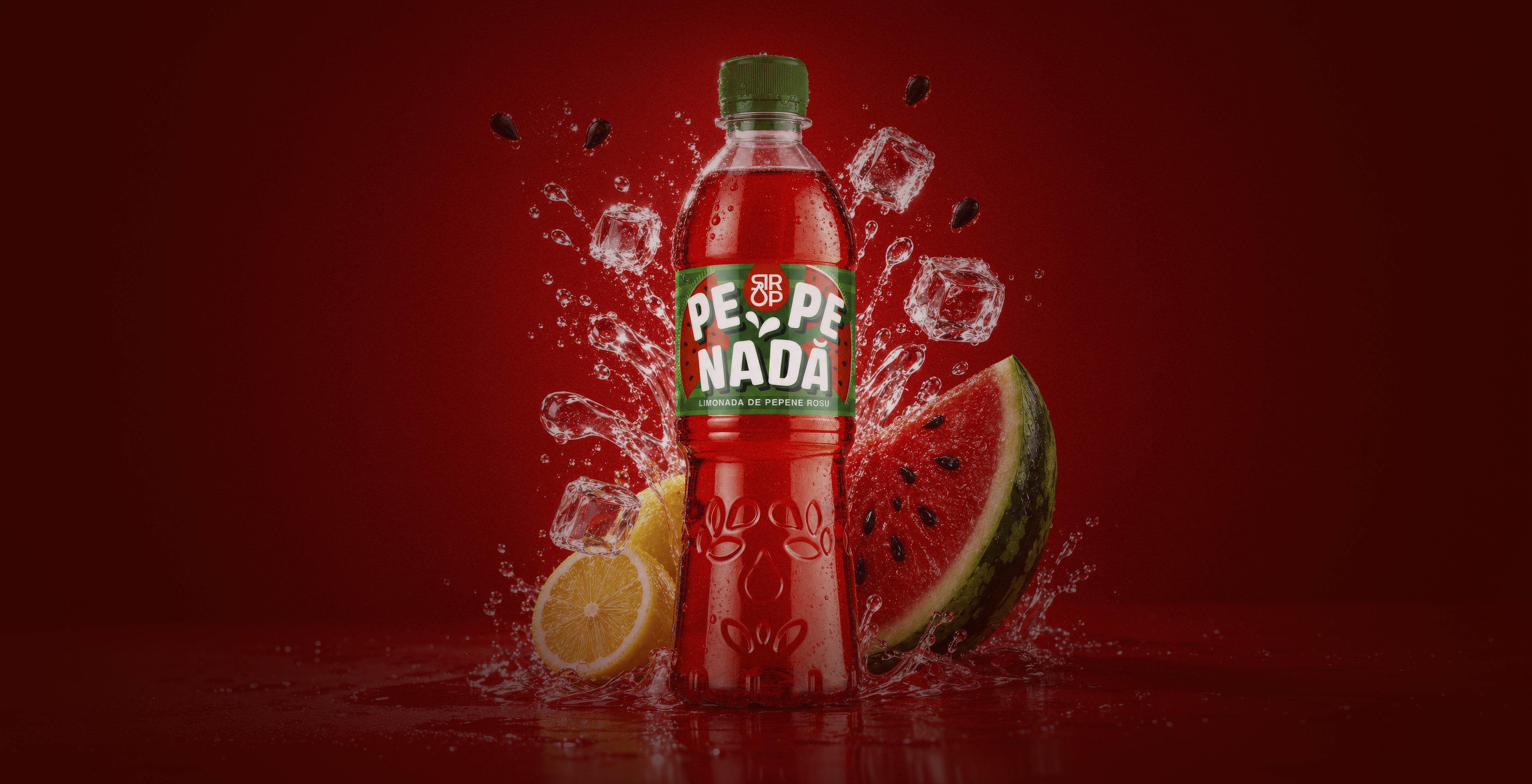
At Modern World Studio, we believe that good packaging design does more than decorate a product — it tells its story and creates an emotional connection with the consumer. For Pepenada, we developed a distinctive visual identity and watermelon lemonade label design that combine bold typography, vibrant colours and dynamic graphic elements. The result is packaging that captures the product’s character and freshness, stands out on the shelf and grabs attention at first glance. Because great design doesn’t wait to be noticed — it commands attention.
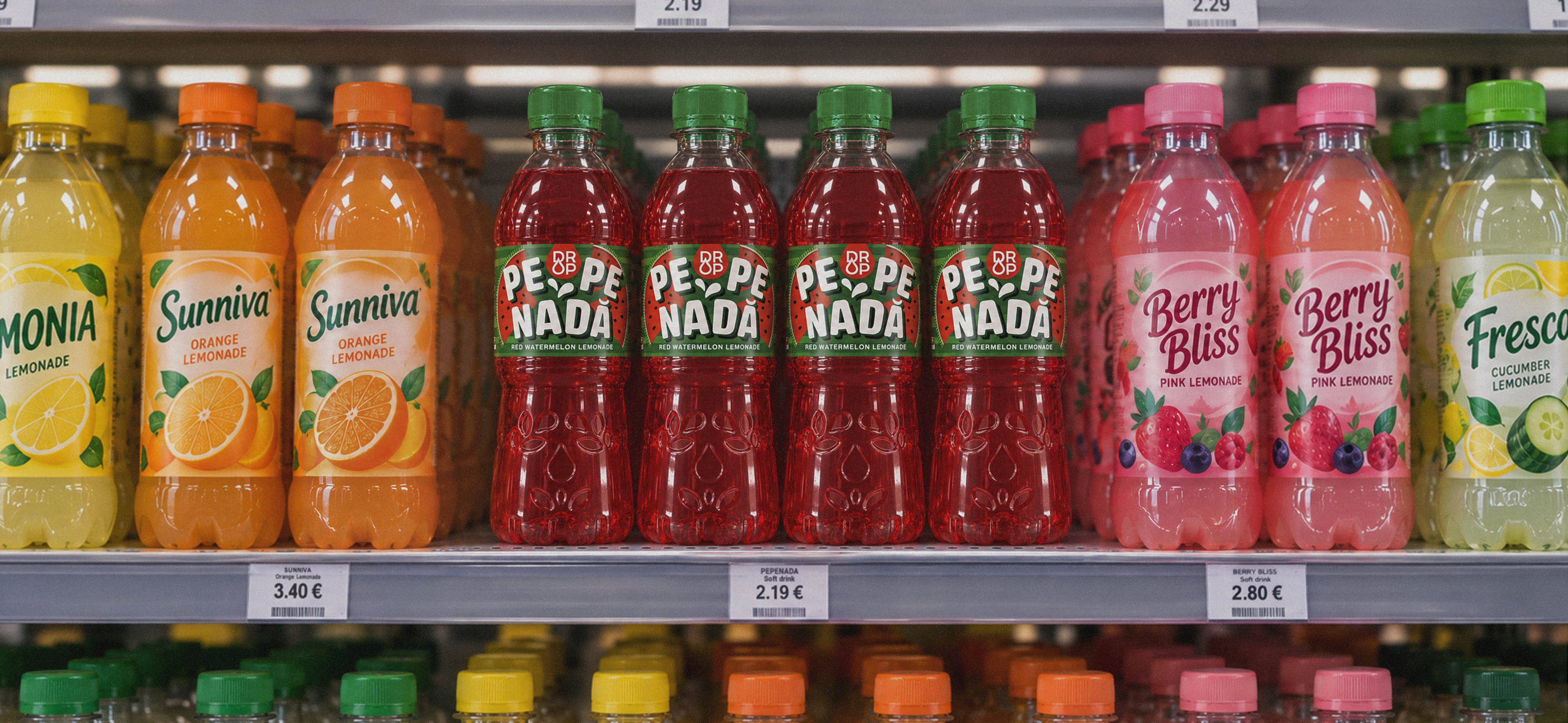
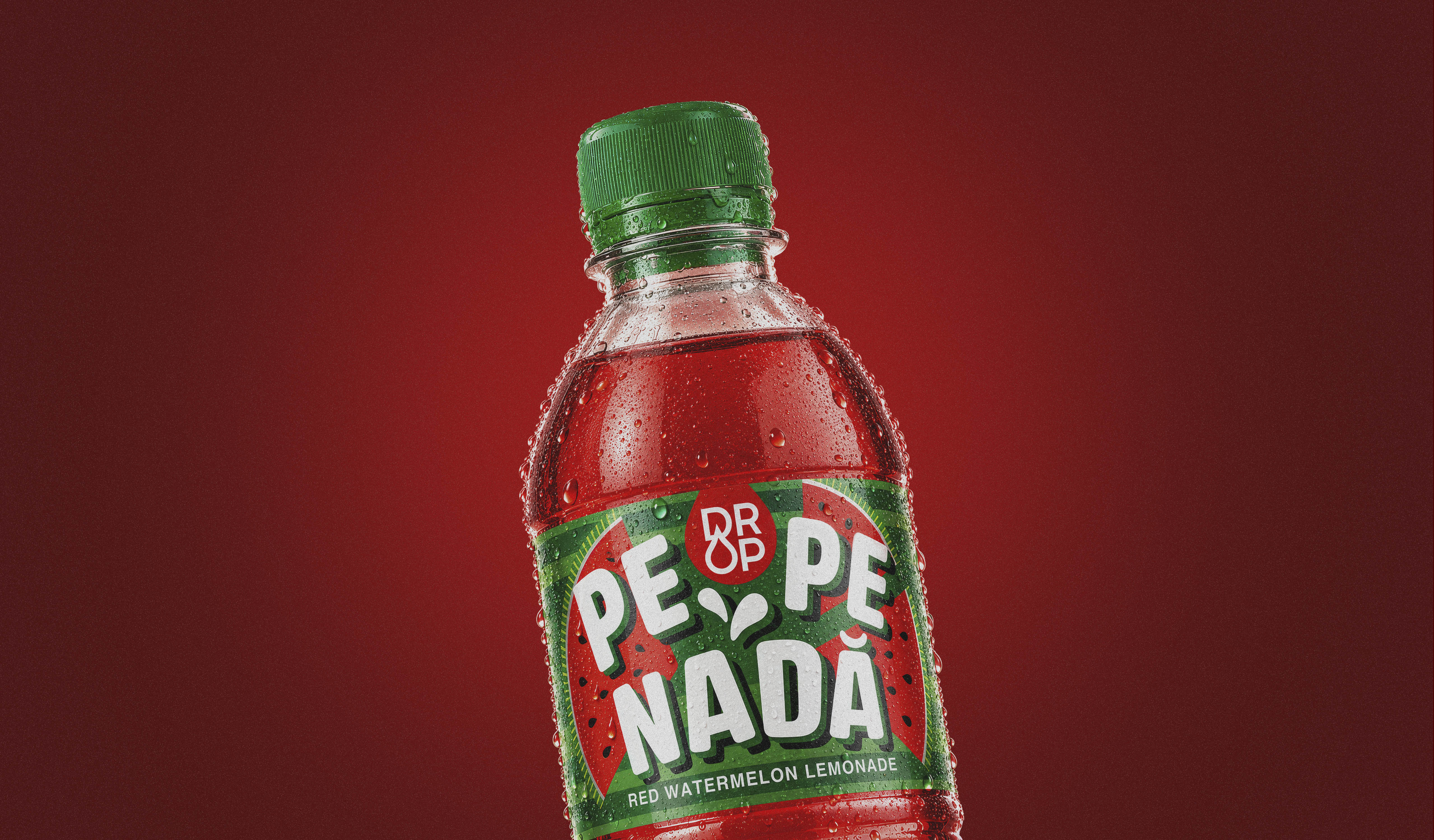

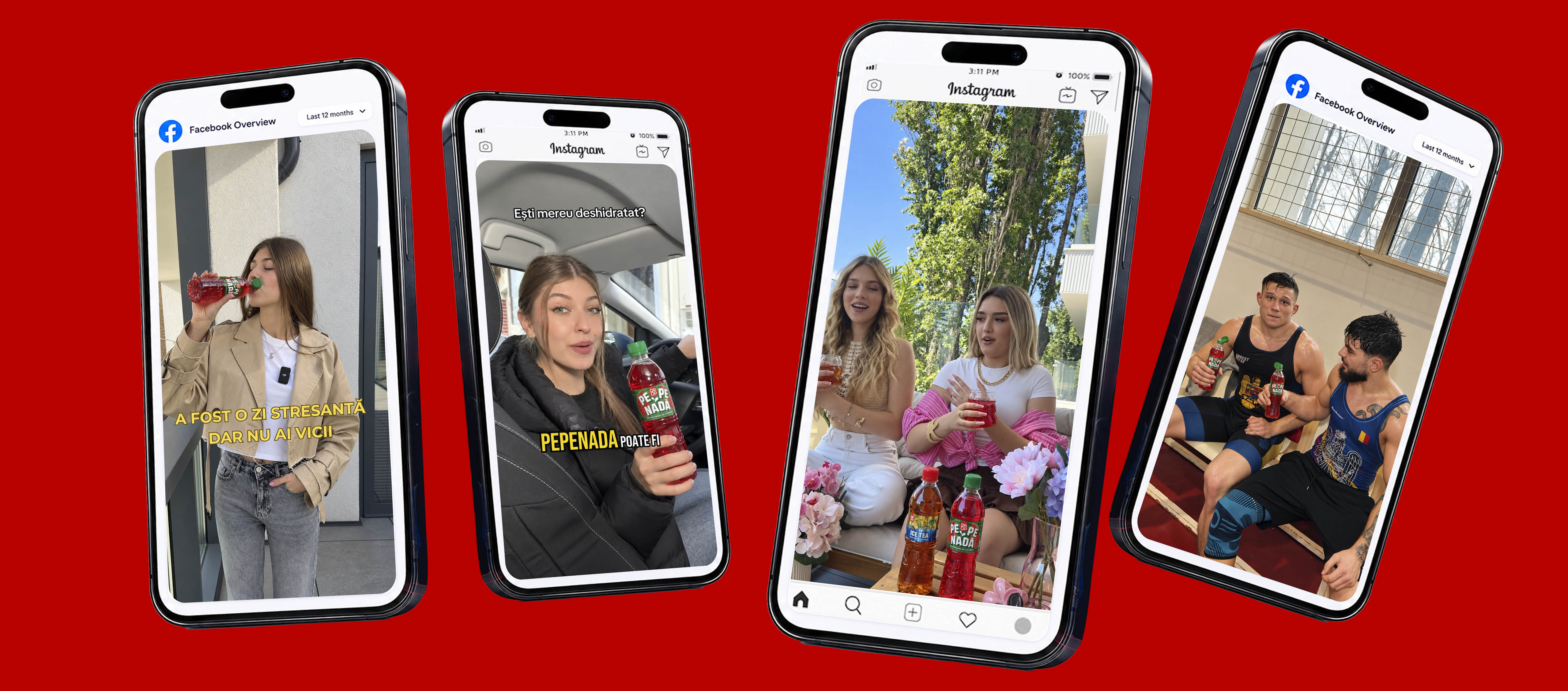
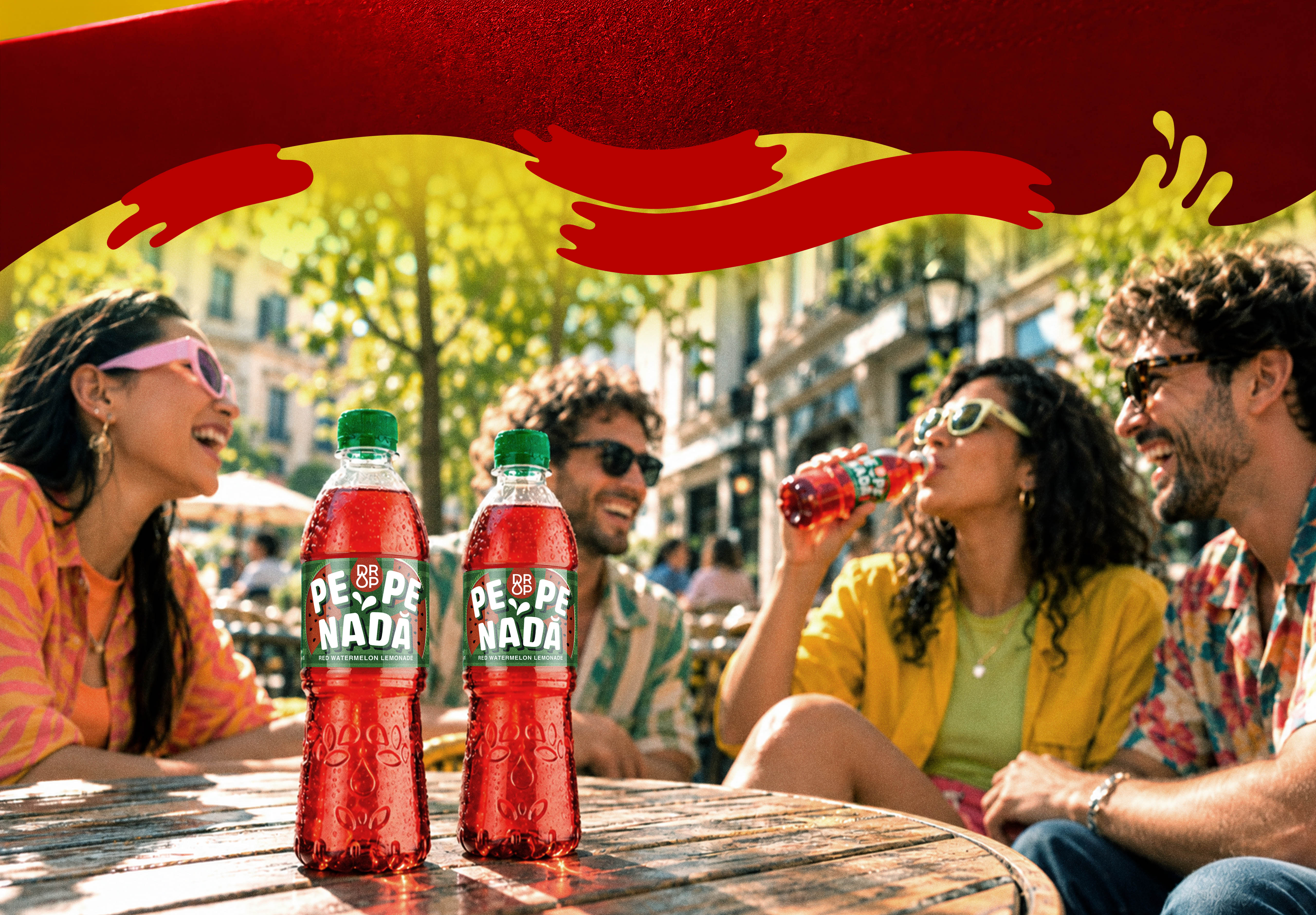
Instagram and TikTok users note that the packaging looks exceptionally photogenic. The product easily catches the eye on store shelves against the traditional and more uniform labels of major soda brands. It is praised as "perfect for summer photos and videos." This indicates that PEPENADA's visual identity is its core strength and the main driver of its viral success among Gen Z users in Romania.
Social media feedback shows that Pepenada's visual identity does half of the sales work for Europlant. The beverage is perceived not just as a drink, but as a summer "accessory." Its design blends naturally into influencers' hands and short-form videos, transforming the packaging itself into a self-advertising tool.