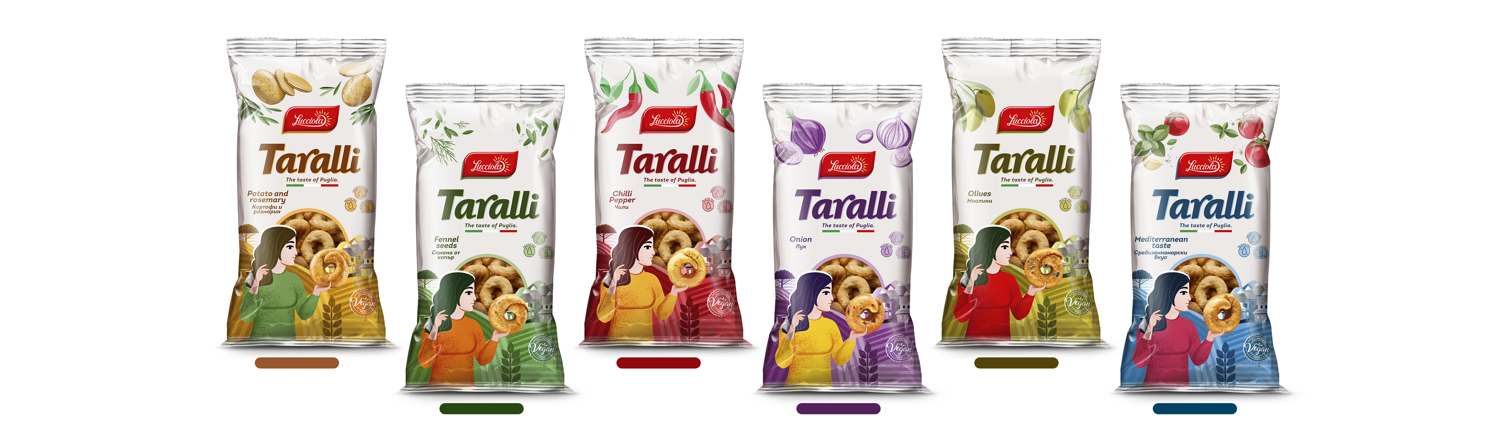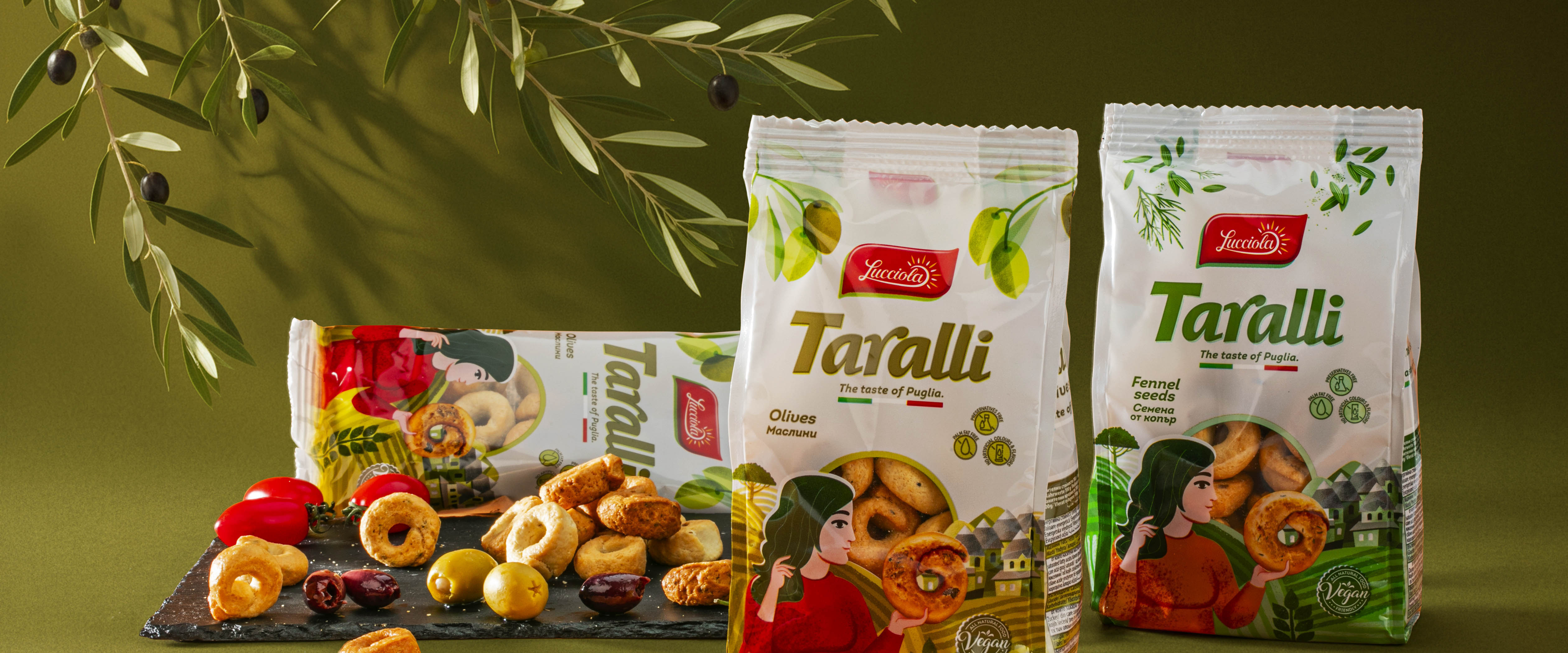

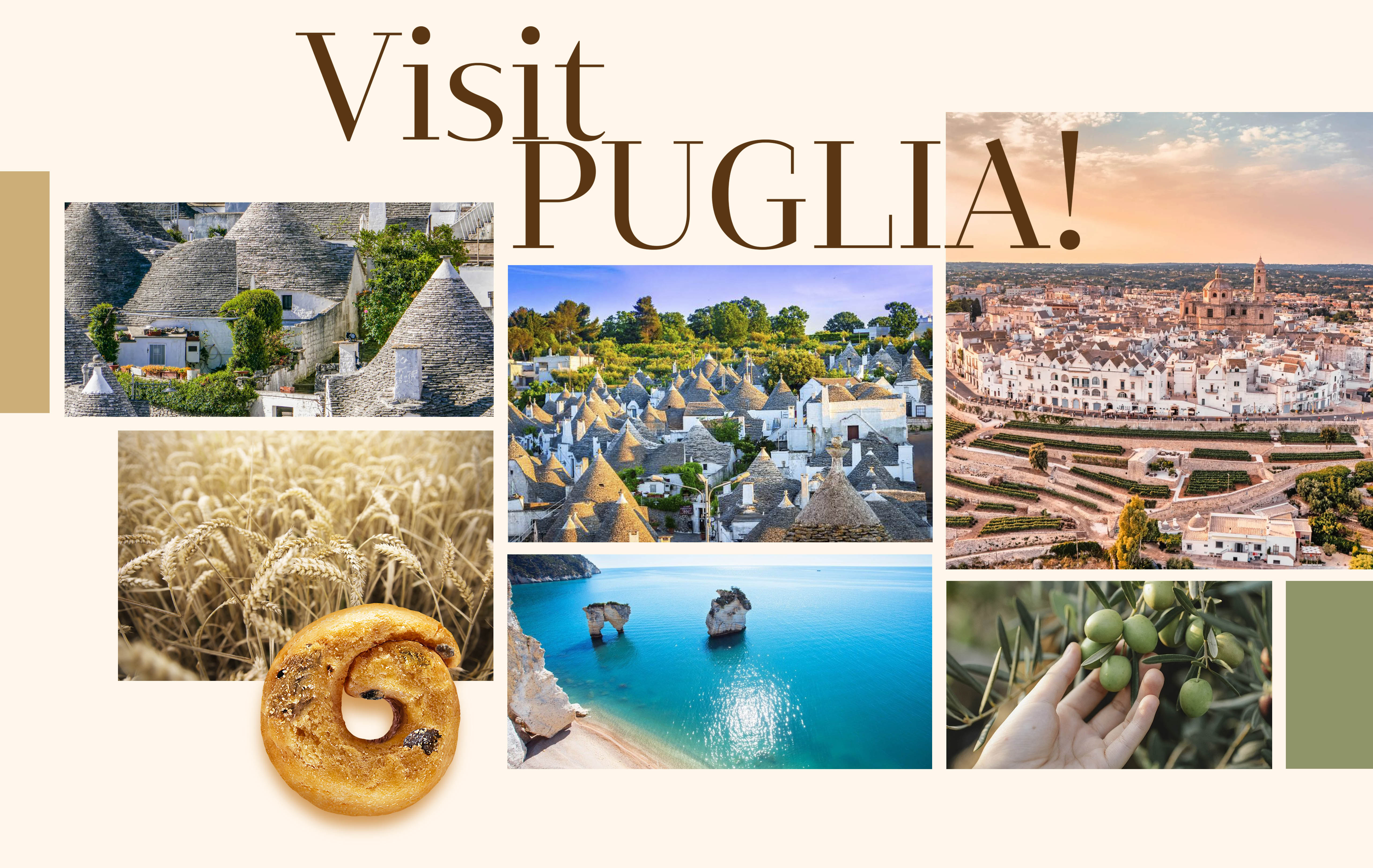
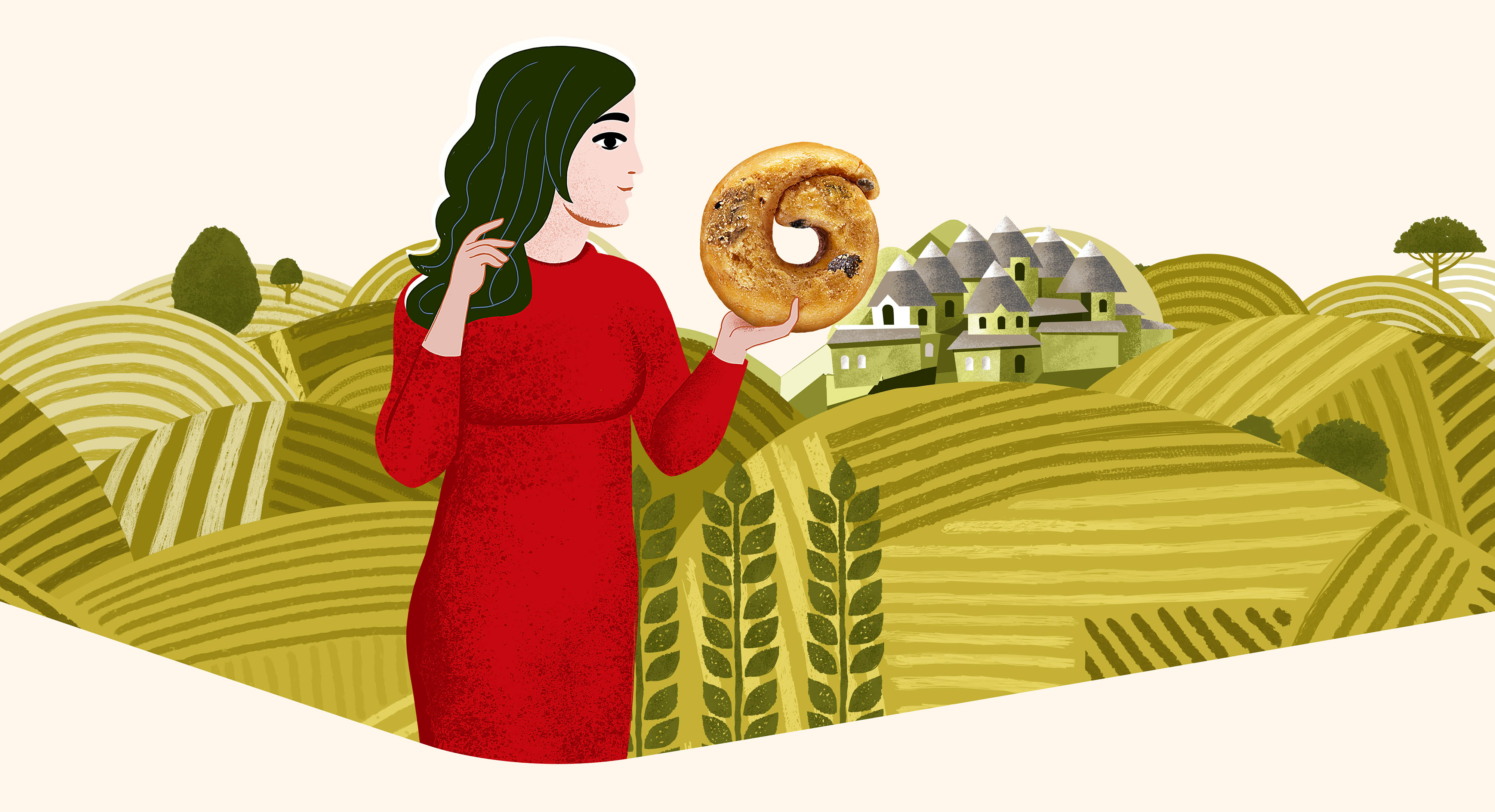
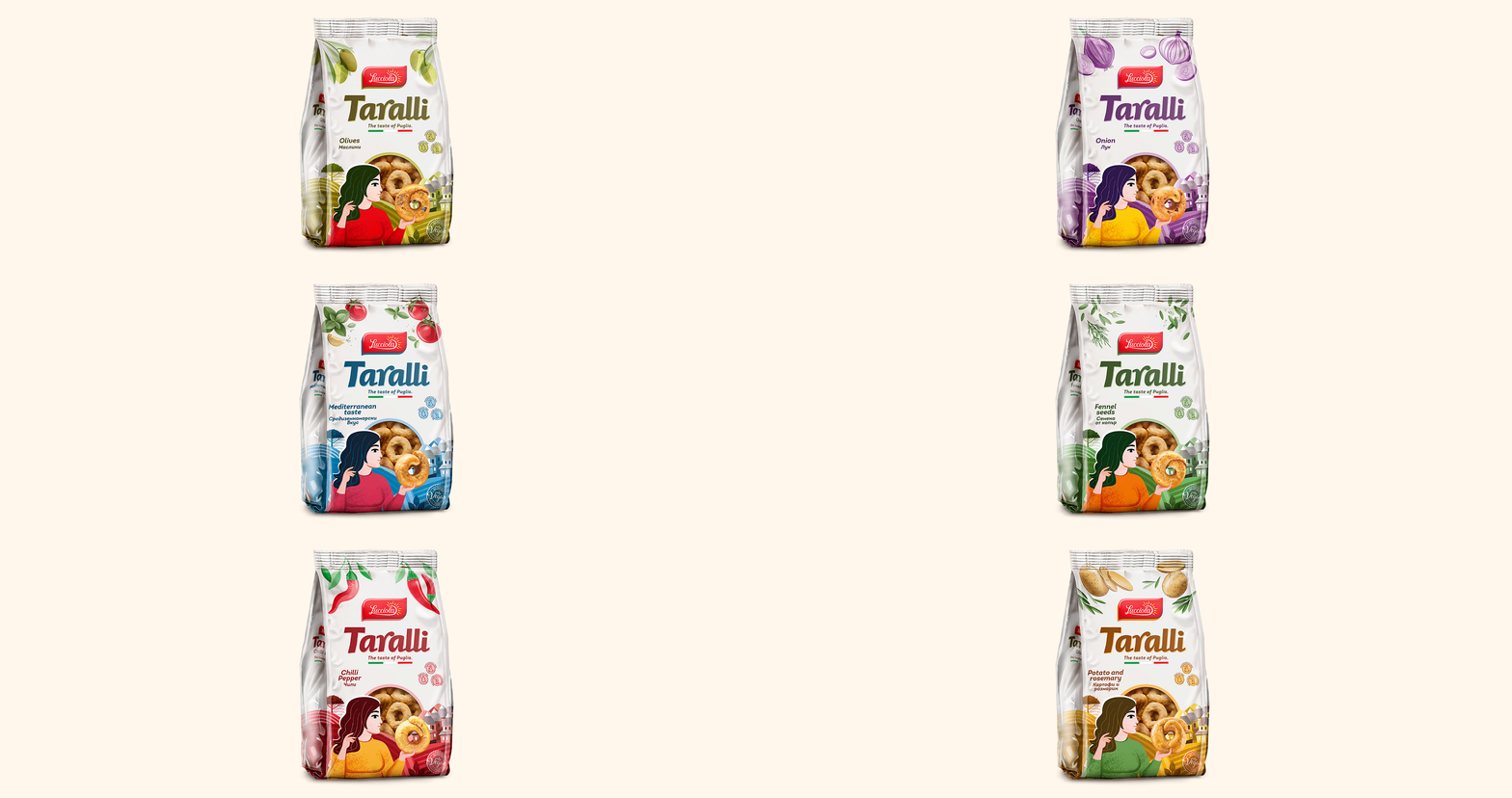
The Taralli project is a visual interpretation of the flavor and spirit of Puglia – the southern Italian region renowned for its sun-drenched land, olive groves, and authentic culinary culture. The team at Moderen Svyat Studio created packaging designs for traditional Italian crackers (taralli) in six different flavors: olives, peppers, spices, onion, Mediterraneo, and more. Each variety is presented with its own distinctive accent, yet all are united by a cohesive artistic language.
Typography and Structure
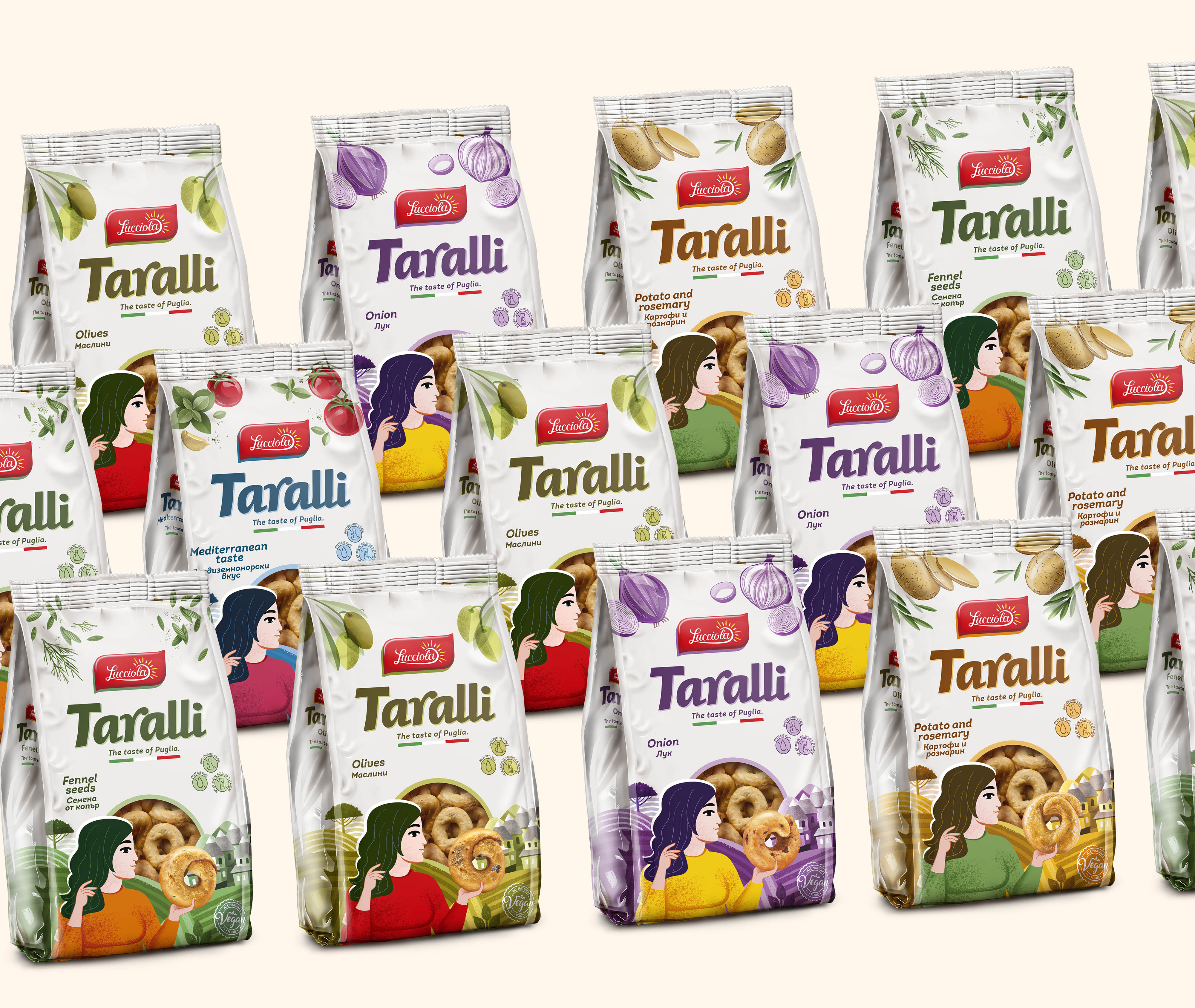
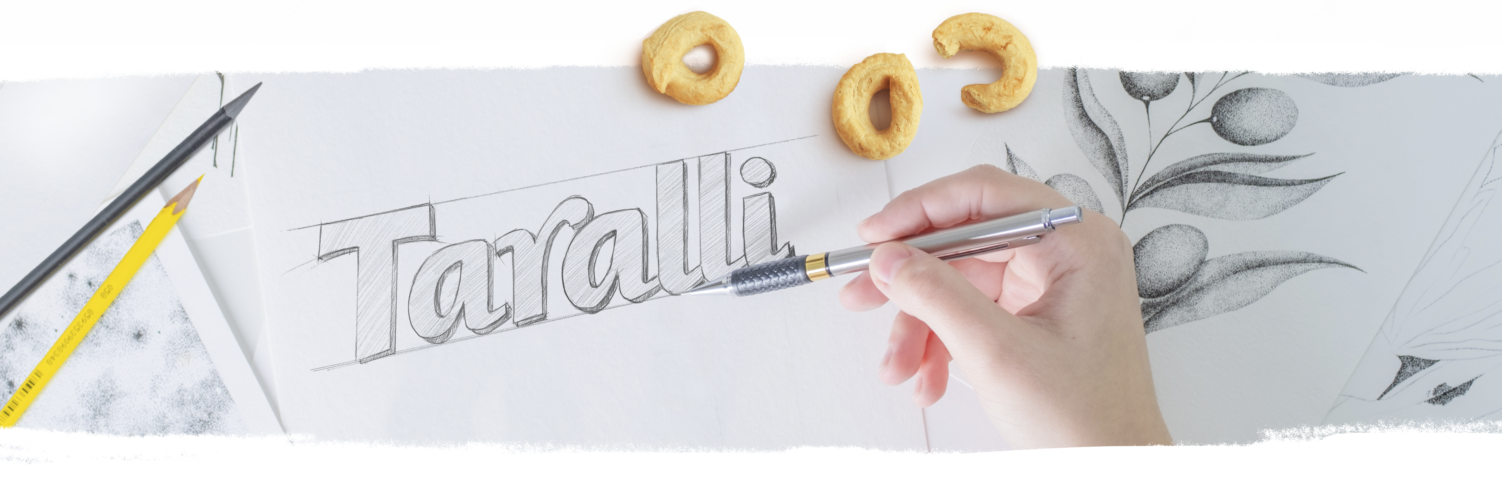
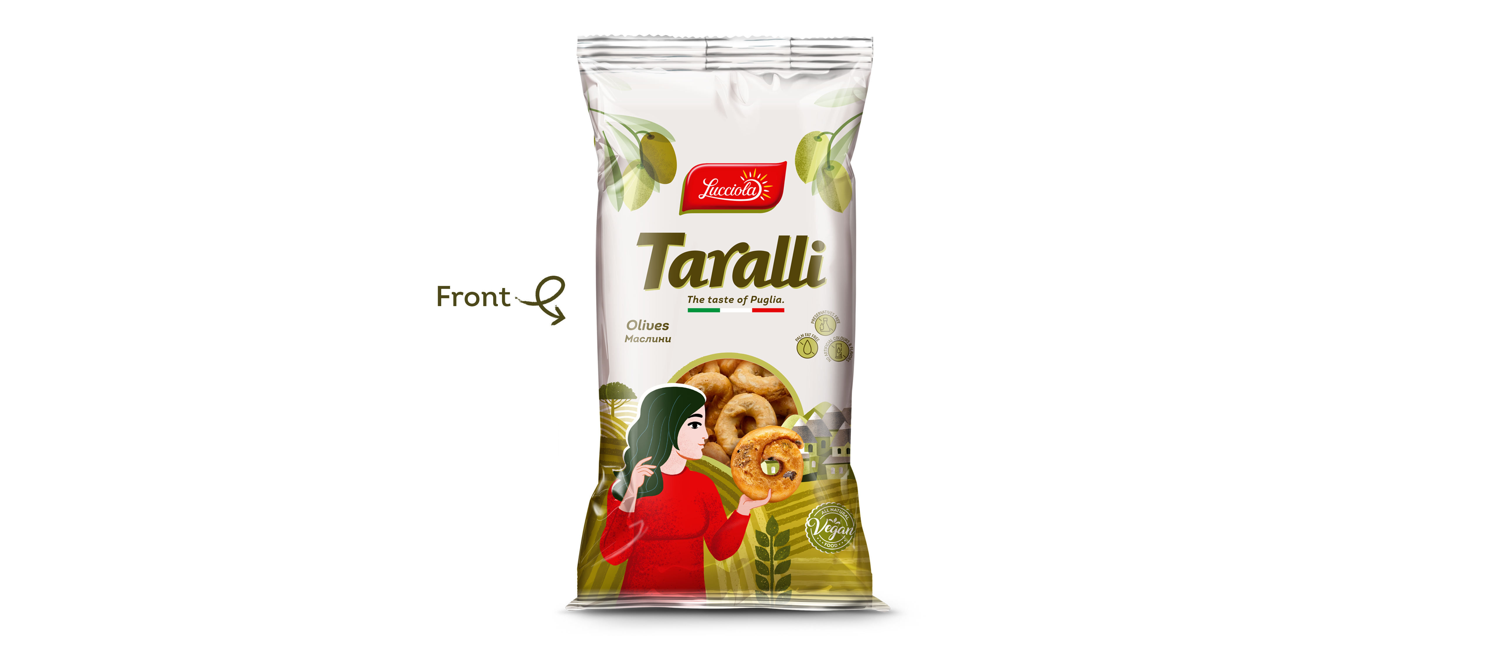
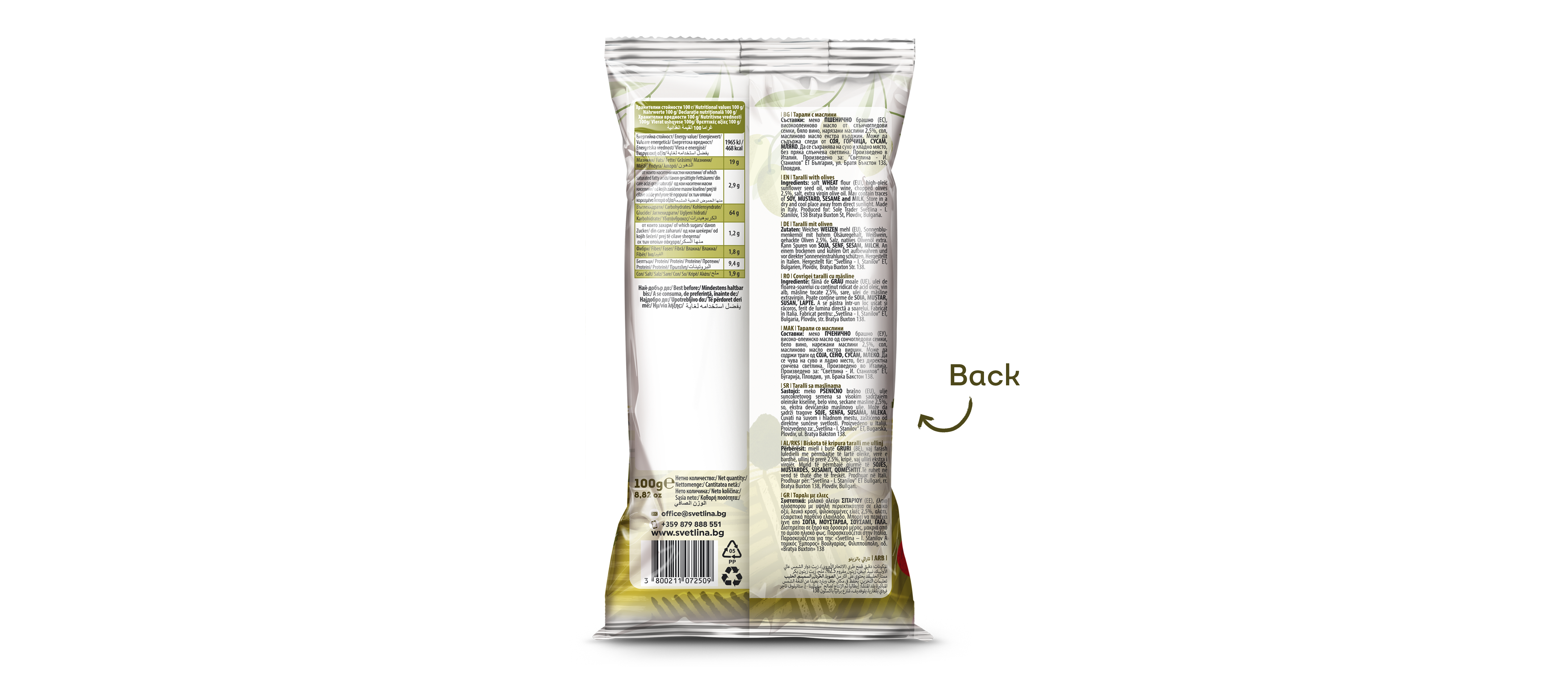
The name “Taralli” is rendered in a soft, elegant typeface. Supporting elements use clear, legible typography suitable for multilingual communication. The information block on the back is organized to balance rich content with a clean, stylish appearance.

Illustrations with Character
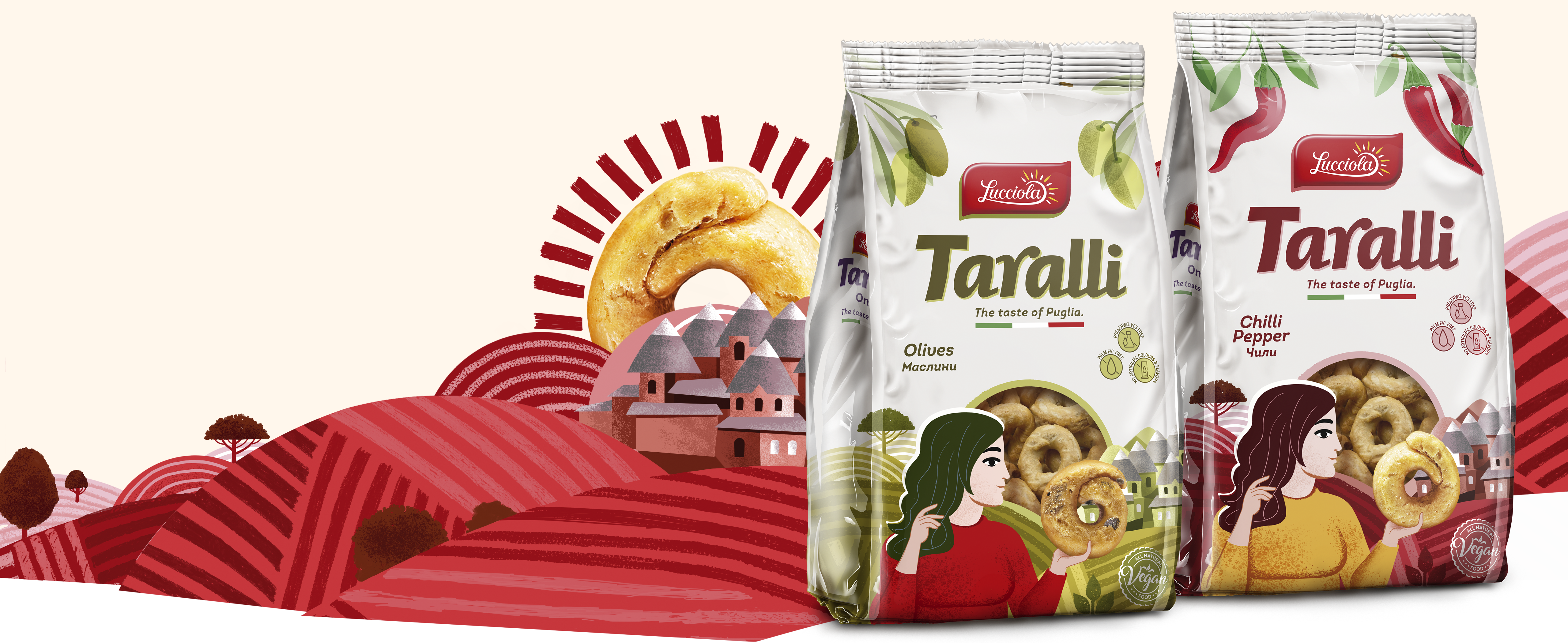
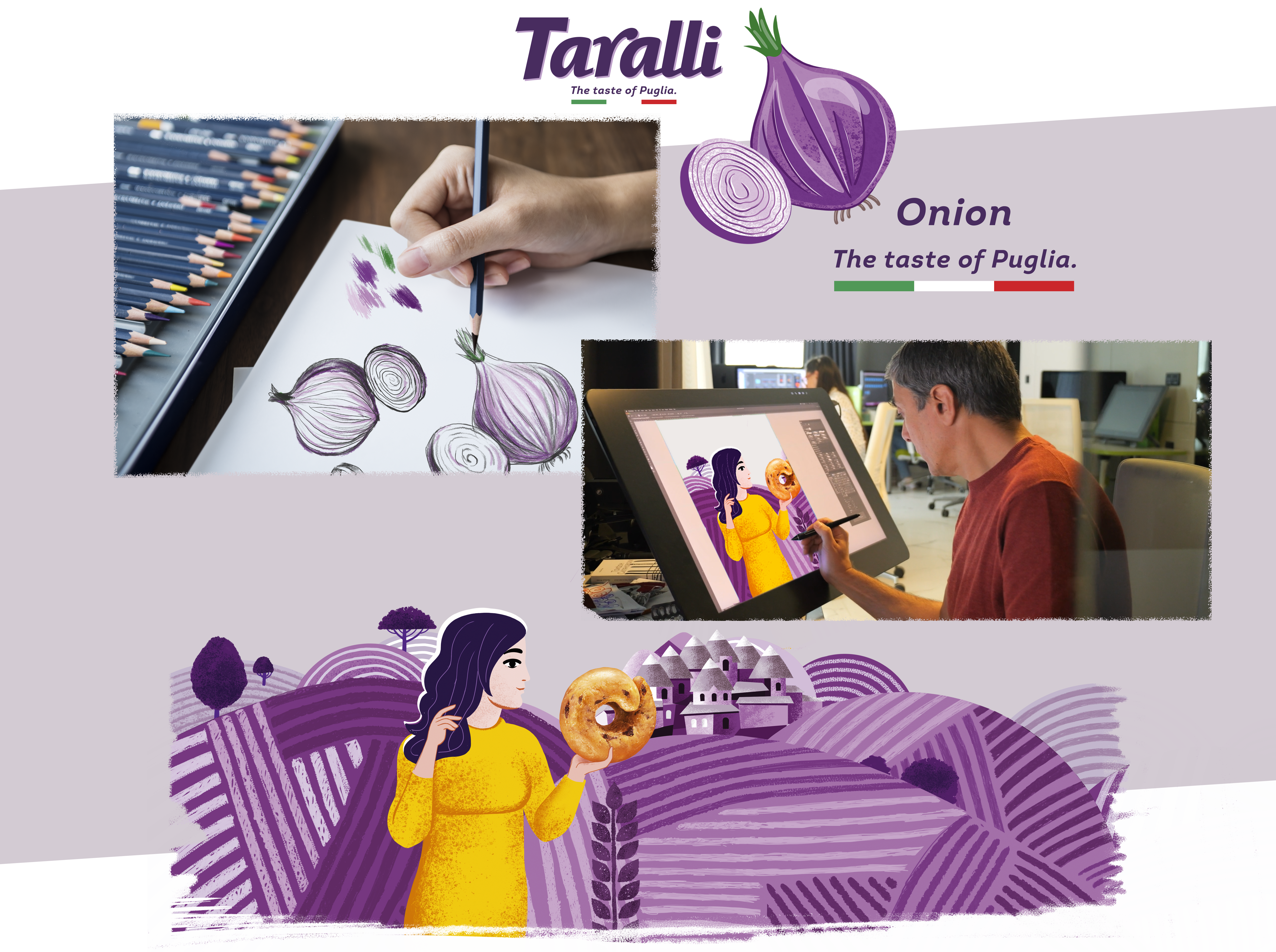
The design is built around a modern illustrative style inspired by the rural landscape of Puglia and the warmth of Mediterranean life. The figurative composition – a traditionally styled woman holding the product – creates an emotional connection and evokes a sense of homemade comfort. Olive branches, rolling hills, and architectural elements reinforce the feeling of origin and history.
A Unified Line with Recognizable Variations
Despite the diversity of flavors, the packaging follows a consistent structure, with each flavor distinguished by a characteristic color palette and small illustrative details linked to the ingredients. This allows for easy visual recognition and supports the creation of a strong brand identity on the shelf.