Client:
European Importing Company
Four Seasons Market
TO PORTFOLIO
Four Seasons Market
Supermarket chain branding
Services:
Brand creation
,
Brand identity design
Industry:
Groceries
,
Dairy products and Ice cream
,
Sweets
,
Meat and fish products
,
Water, soft drinks, juices
,
Tea and coffee
,
Facades, stands, showcases
TO PORTFOLIO

The Backstory
European Importing Company is an American company specializing in the import and distribution of food products and beverages from Western Europe, Eastern Europe, and other regions around the world. The company is one of the leading food distributors in the western United States, serving California, Oregon, Washington, Nevada, Colorado, and Arizona. Its product range is available to American and ethnic supermarkets, restaurants, hotels, catering companies, and specialty retailers.
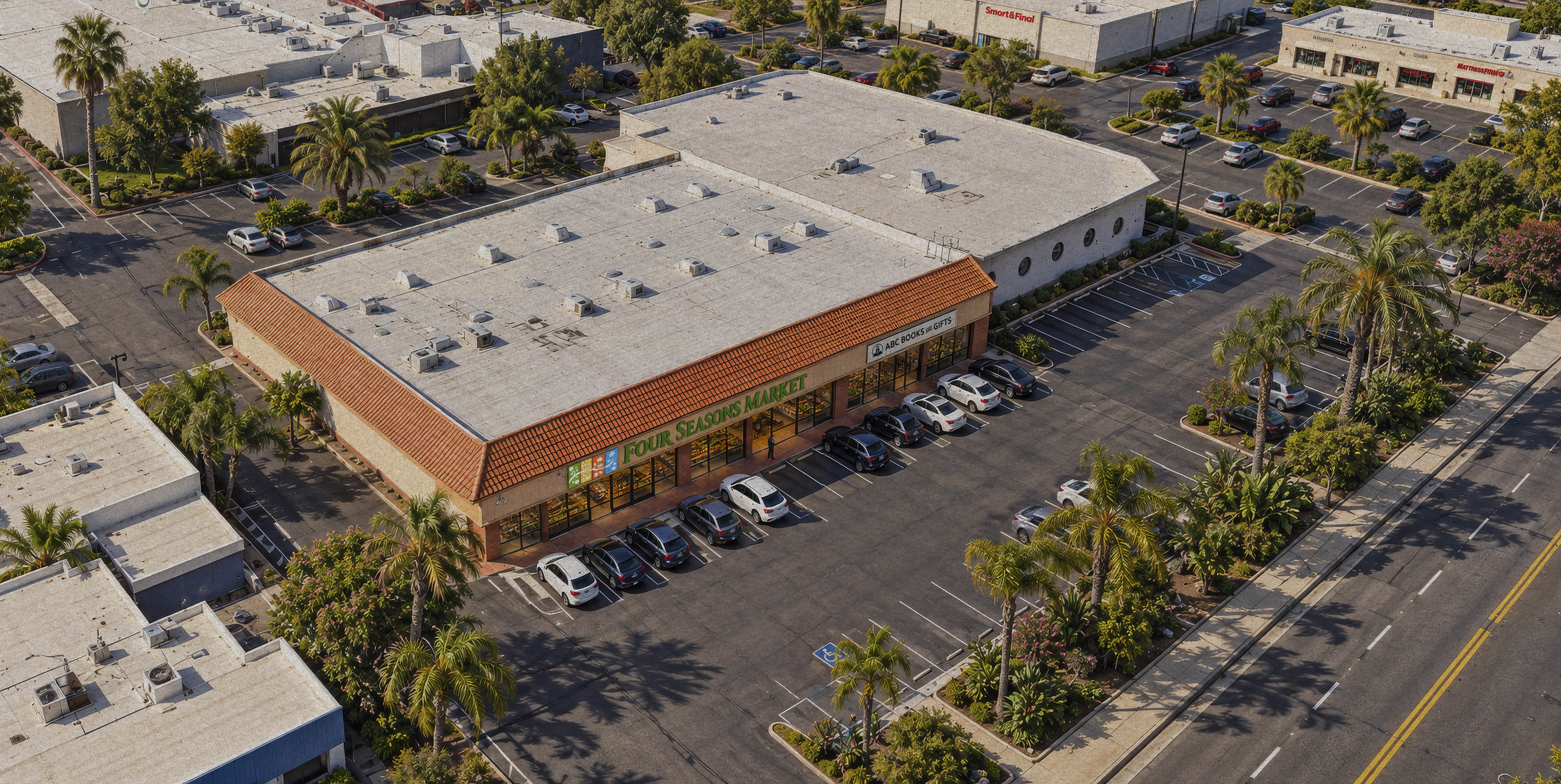
The opening of the Four Seasons Market supermarket in Sacramento (located at 5111 College Oak Dr, Sacramento, CA 95841) marks a pivotal milestone in the development of European Importing Company. With this move, the company is making a strategic transition from an exclusively wholesale B2B (business-to-business) model to direct retail trade (B2C).

The Task
The task presented to the studio is to develop a logo for the new Four Seasons Market supermarket. The logo needs to be vivid, original, emotionally engaging, and highly distinctive compared to other supermarkets in Sacramento.
Four Seasons Market is intended to serve as a physical showcase for the importer’s extensive portfolio of over 4,000 items. This will grant retail customers in Sacramento direct access to the full range of products imported from Eastern and Western Europe. In addition to imported goods, the supermarket will offer fresh fruits and vegetables, a deli counter, fresh seafood, and an on-site bakery. This ensures that regardless of the season, the products offered will always be fresh and relevant. The company also aims to gradually expand Four Seasons Market into a supermarket chain.

The Idea
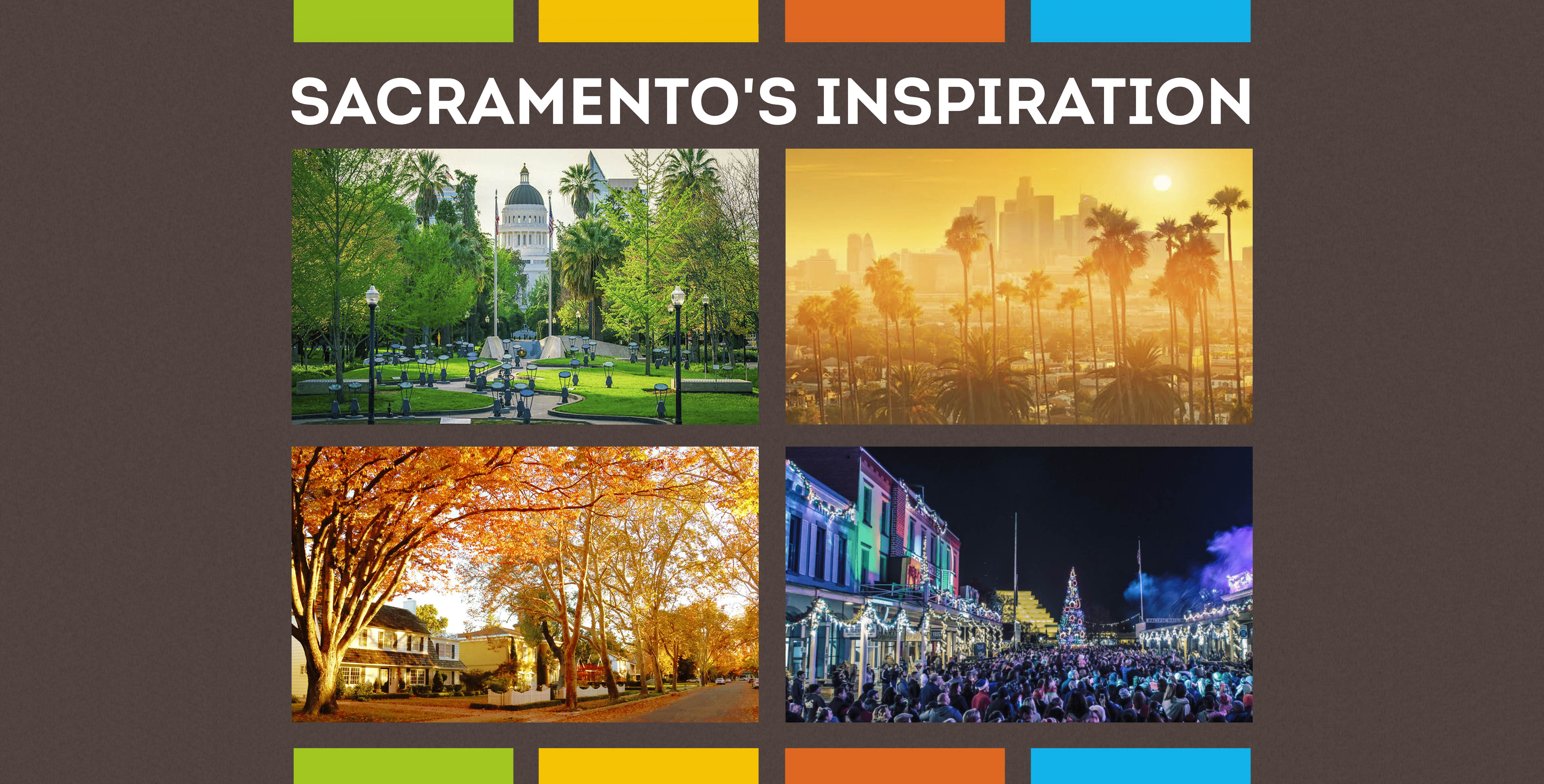
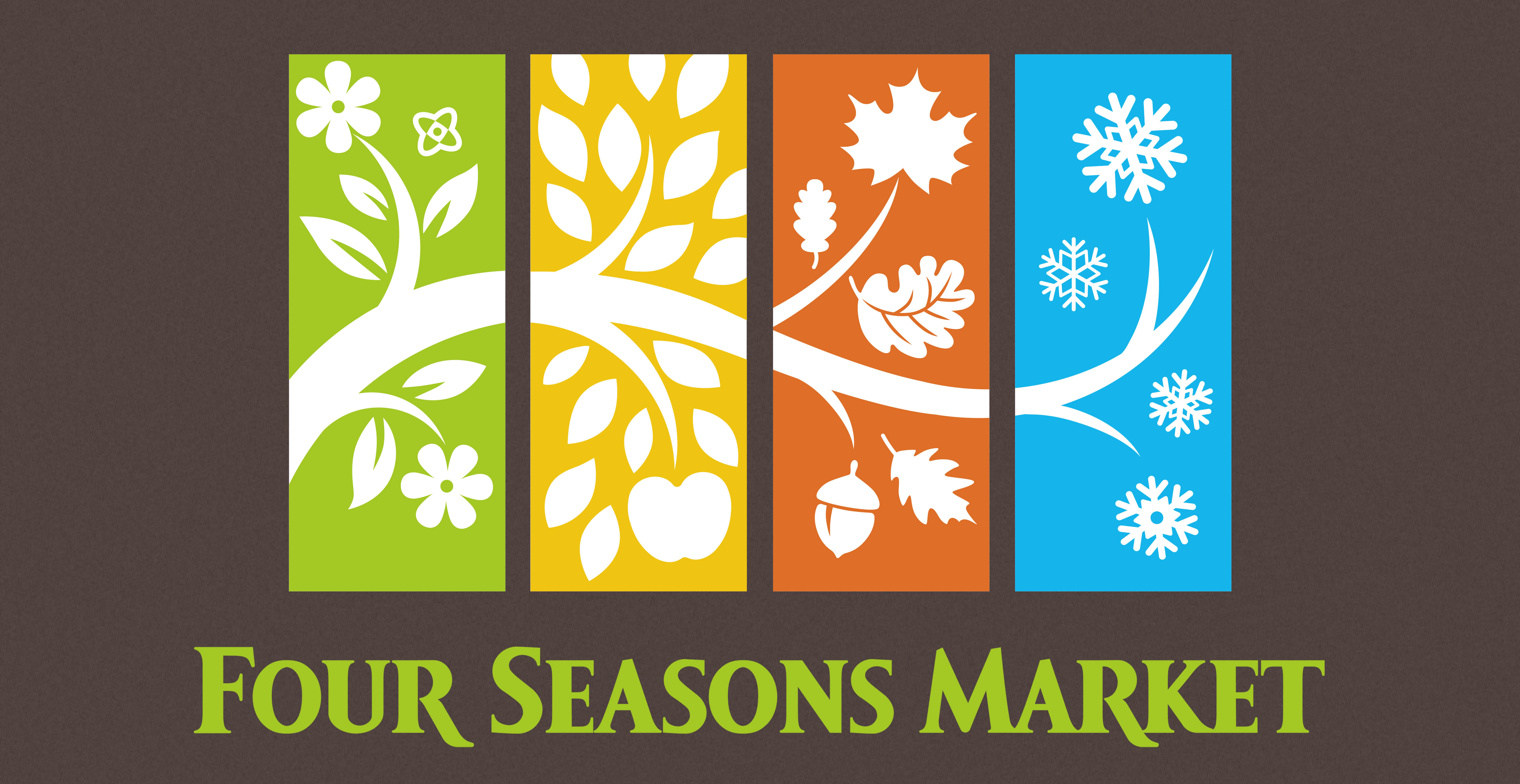
The central idea of the logo is to represent the cyclical nature of nature and the year-round freshness of the offered products through the four seasons. The design achieves this through two main levels of interpretation:
The unifying element is a plant or a tree branch that passes horizontally through the four color fields, connecting them into a single whole. This symbolizes stability, the natural origin of the food, and the fact that the store operates continuously throughout the year.


The Typography
The font features high readability and recognizability: The choice of a clean, solid green color for the text balances the colorful emblem above. The serif typeface with subtle organic curves lends the brand authority, while maintaining a sense of accessibility and market tradition.
The design seamlessly combines numerous details (leaves, flowers, snowflakes, fruits) without making the logo look cluttered. The white silhouette of the branch serves as a unifying compositional element that keeps the layout stable.
The color palette is vibrant and positive. It instantly associates the brand with a healthy lifestyle, a diverse spectrum of flavors, and a rich product portfolio.
The logo possesses high adaptability. The illustrations utilize the negative space technique, allowing the white silhouettes to stand out against the colorful background.


The Colors
The logo is divided into four vertical rectangles (panels), each representing a specific season through distinct graphic elements and color:
- Spring – Green: The elements used include blooming flowers and young leaves, symbolizing new beginnings, the awakening of nature, and fresh vegetables.
- Summer – Vibrant Yellow: The branch is adorned with leaves reminiscent of a wheat field, with an apple added at the bottom. This symbolizes the ripening of fruit, the sun, and the peak of the harvest.
- Autumn – Deep Orange: Maple and oak leaves, along with acorns. The graphic illustrates harvest time and warm, traditional flavors.
- Winter – Blue: A clean branch with snowflakes, hinting at coziness, holiday delicacies, as well as frozen foods and seafood. The graphic reflects the store's ability to provide everything needed even during the coldest months.


The Result
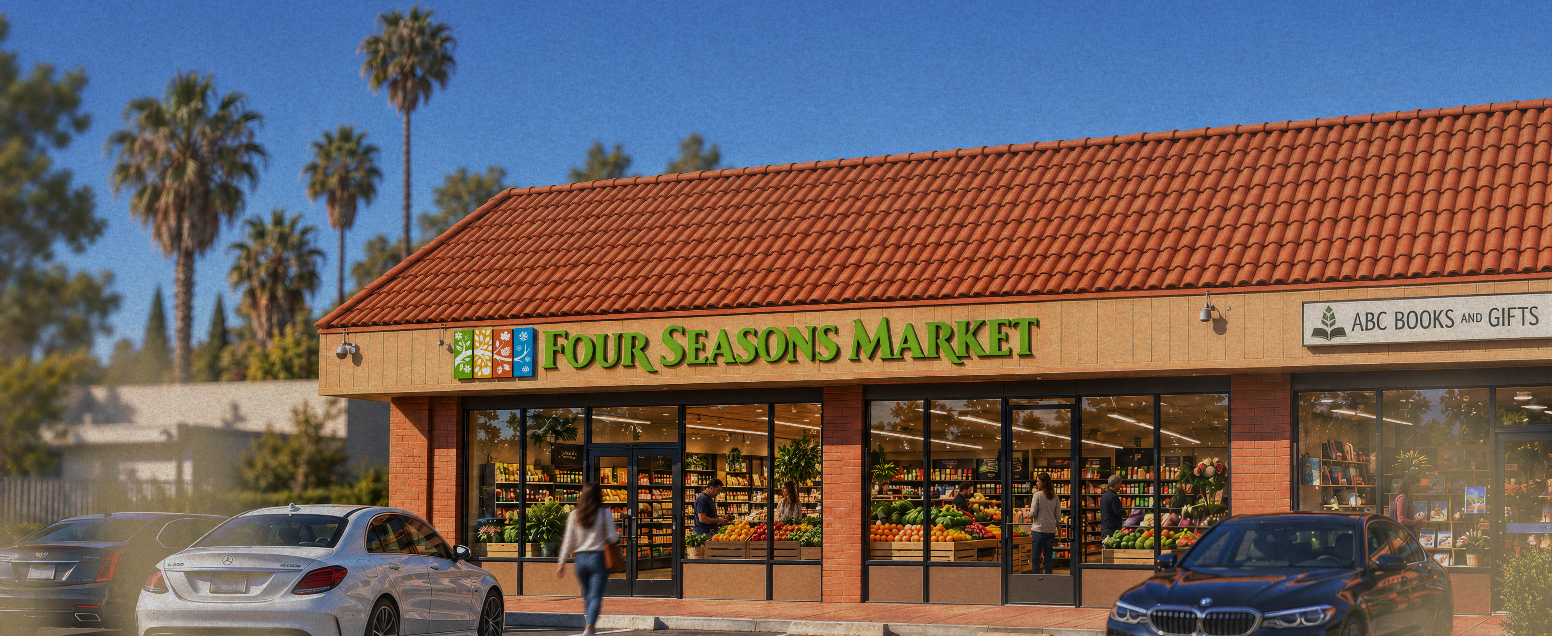
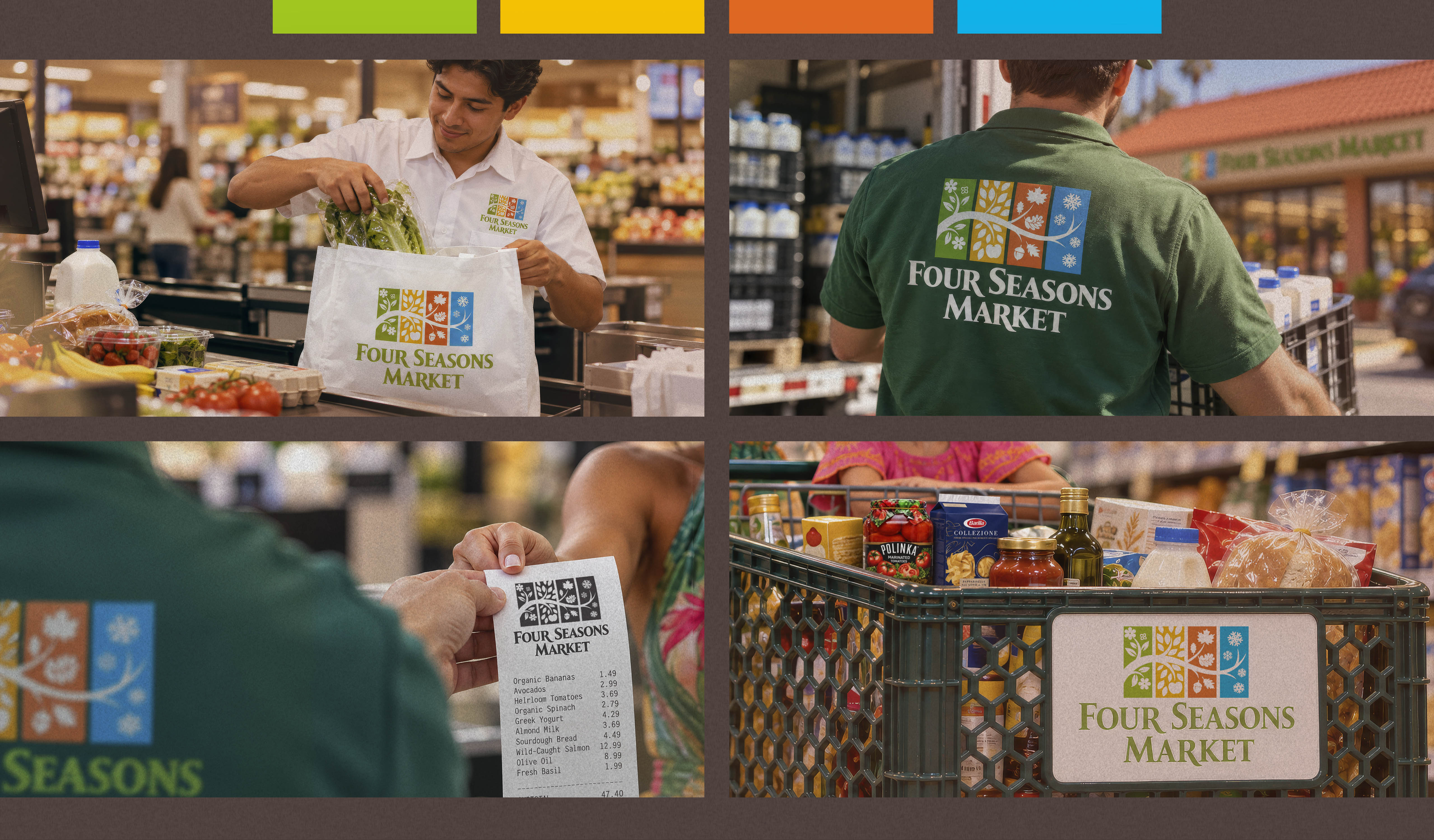
The created logo is exceptionally easy to brand across various surfaces – from large outdoor store signage to shopping bags, labels, and digital platforms.
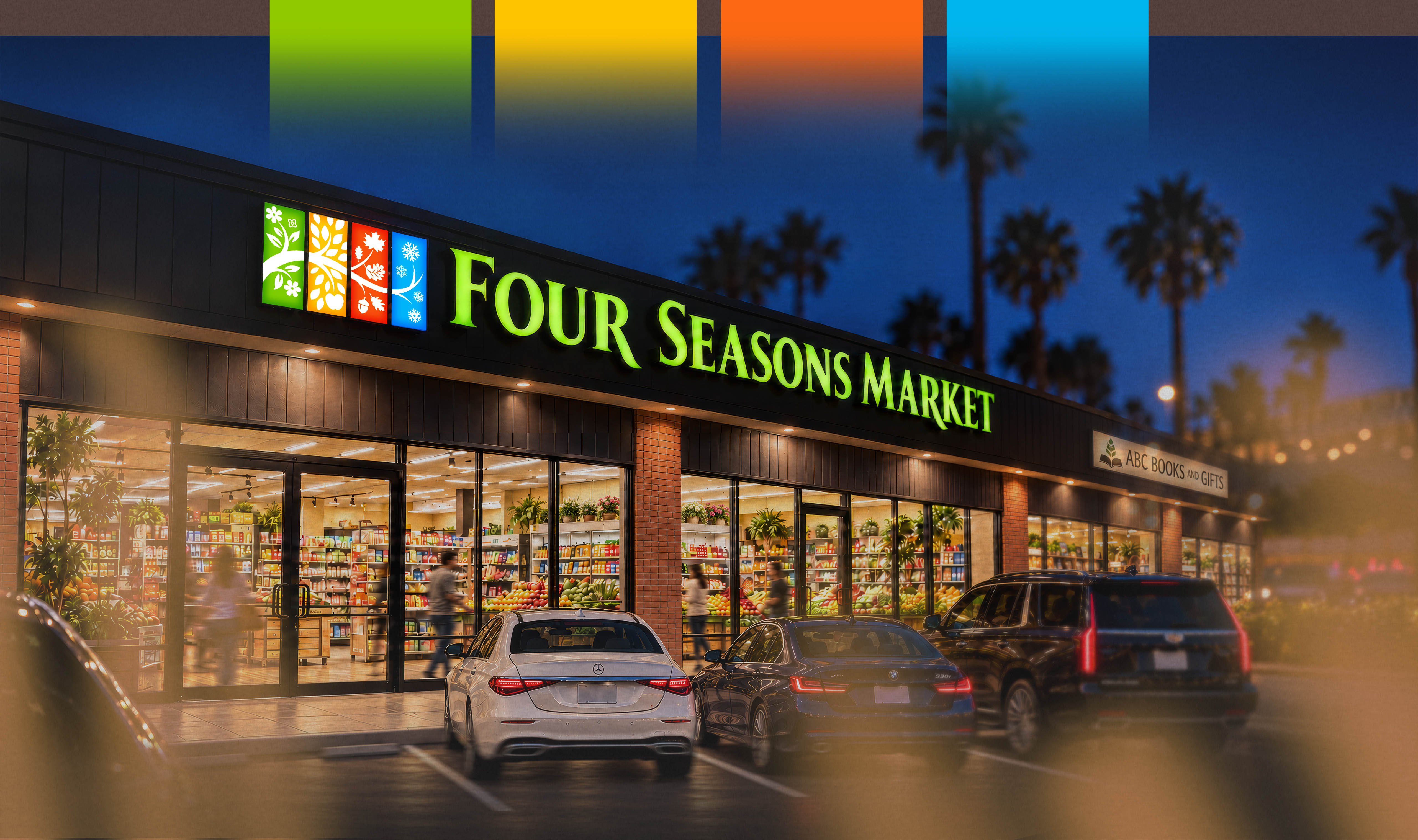
A visual analysis of the Four Seasons Market supermarket reveals a successful blend of classic suburban American architecture and modern, welcoming retail design. The storefront is engineered to seamlessly blend into the Sacramento environment while simultaneously drawing in passing customers with its fresh and inviting appearance.
Placing the logo on employee uniforms and reusable shopping bags serves as a constant reminder that the store offers premium products regardless of the season. When consumers spot the logo on receipts, shopping carts, bags, and the backs of employee uniforms, they subconsciously perceive Four Seasons Market as a stable, organized, and trusted supermarket chain rather than just an ordinary neighborhood grocery store. This leaves the customer with a complete premium experience, significantly increasing the likelihood of repeat visits.


Emotional Impact
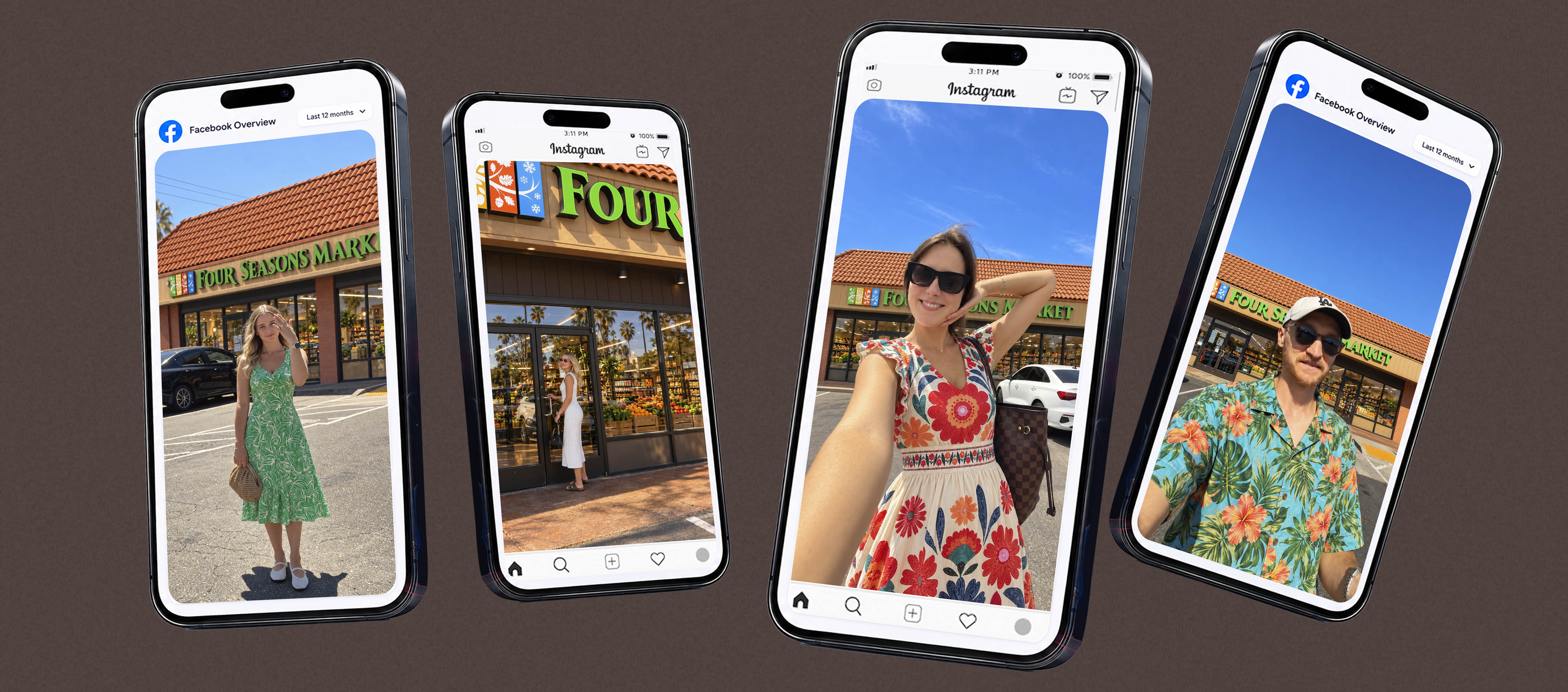
The Four Seasons Market logo is designed to deliver an exceptionally mature, consistent, and professional user experience. This approach transforms it from a simple emblem into a powerful tool for building trust and brand identity.

The Conclusion
The creation of the Four Seasons Market logo played a key strategic role in the business success of EUROPEAN IMPORTING COMPANY. The logo visualizes the new brand as a recognizable name in the highly competitive Sacramento market. The achieved results can be summarized as follows:
- Successful Market Positioning and Identity: The company quickly entered the B2C market. Since the company was primarily known within corporate circles (B2B), the new logo helped the supermarket rapidly establish its own friendly and accessible identity for end consumers.
- A Clear Marketing Promise: The design instantly communicates to the consumer what to expect – year-round abundance and freshness. The logo eliminates the need for lengthy advertising explanations, as the four-seasons symbolism is immediately deciphered by people of all nationalities.